Getting familiar with ggplot2
Version March 5th 2020
knitr::opts_chunk$set(echo = TRUE)
library(tidyverse)
## ── Attaching packages ───────────────────────────────────────────────────────────── tidyverse 1.3.0 ──## ✓ ggplot2 3.2.1 ✓ purrr 0.3.3
## ✓ tibble 2.1.3 ✓ dplyr 0.8.4
## ✓ tidyr 1.0.2 ✓ stringr 1.4.0
## ✓ readr 1.3.1 ✓ forcats 0.4.0## ── Conflicts ──────────────────────────────────────────────────────────────── tidyverse_conflicts() ──
## x dplyr::filter() masks stats::filter()
## x dplyr::lag() masks stats::lag()library(dplyr)
library(ggplot2)library(datasets)
head(trees)## Girth Height Volume
## 1 8.3 70 10.3
## 2 8.6 65 10.3
## 3 8.8 63 10.2
## 4 10.5 72 16.4
## 5 10.7 81 18.8
## 6 10.8 83 19.7str(trees)## 'data.frame': 31 obs. of 3 variables:
## $ Girth : num 8.3 8.6 8.8 10.5 10.7 10.8 11 11 11.1 11.2 ...
## $ Height: num 70 65 63 72 81 83 66 75 80 75 ...
## $ Volume: num 10.3 10.3 10.2 16.4 18.8 19.7 15.6 18.2 22.6 19.9 ...First step: inform your dataset using one of the two options
ggplot(data= trees) # option 1
trees %>% ggplot () # option 2
Second step: precise the aesthetics of your plot (x-axis and y-axis)
trees %>% ggplot (aes(x=Height,y=Volume)) 
Third step: specifiy the geom. For example, I used geom_point
trees %>% ggplot (aes(x=Height,y=Volume)) +
  geom_point()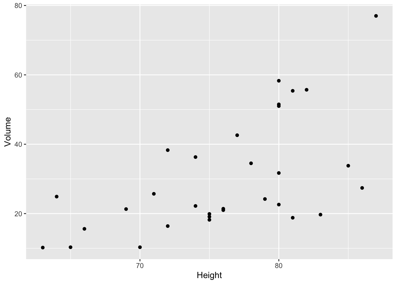
After these 3 steps, you can start customizing your plot. yoohoo
How to add a linear regression? use geom_smooth
trees %>% ggplot (aes(x=Height,y=Volume)) +
  geom_point() +
geom_smooth(method="lm",se=FALSE) 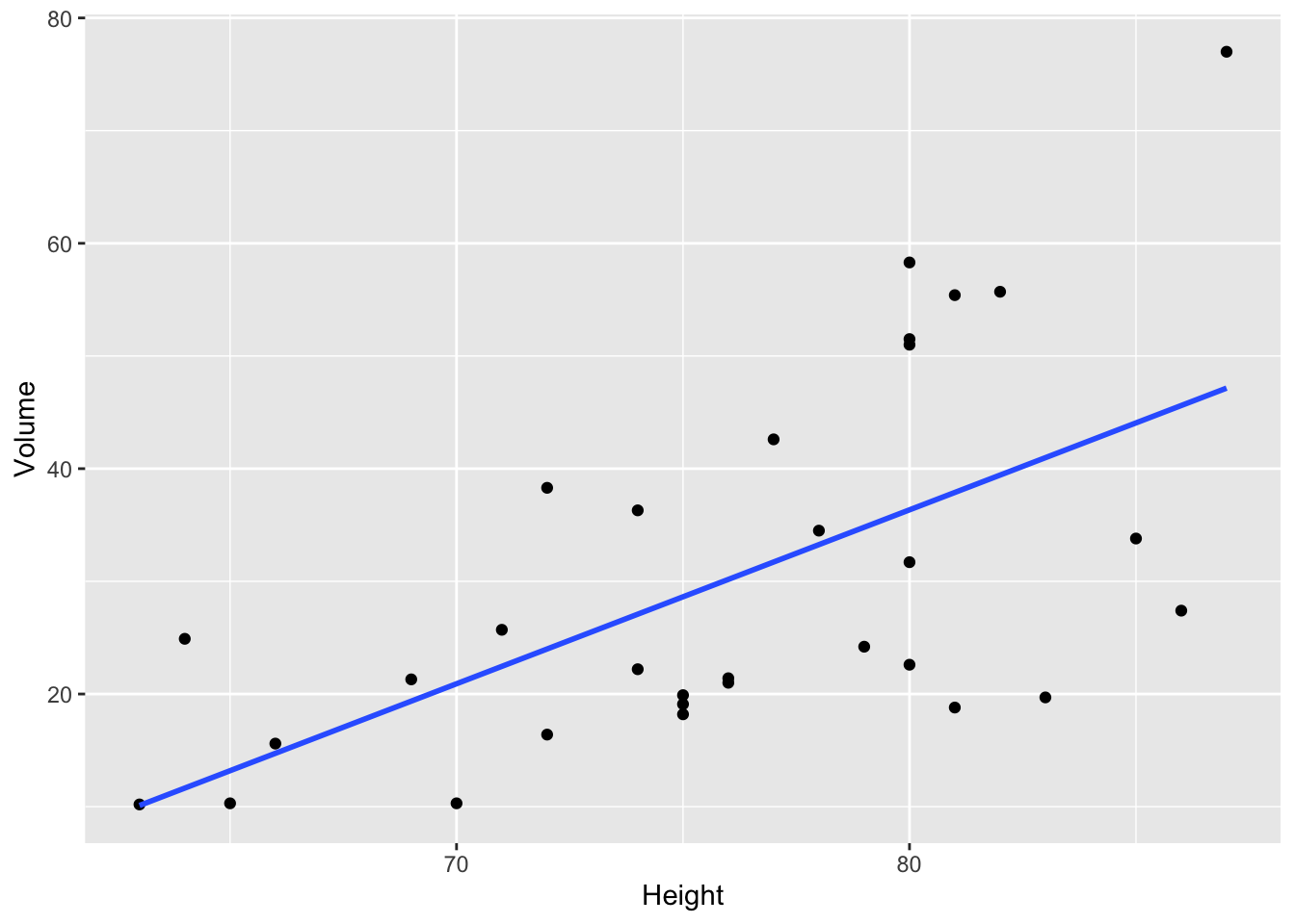
By adding se=FALSE, the confidence interval around smooth is not displayed
Note that by default, se=TRUE
Modify the apparence of the points (size and color)
trees %>% ggplot (aes(x=Height,y=Volume)) +
  geom_point(size=3,color="orange") +
geom_smooth(method="lm") 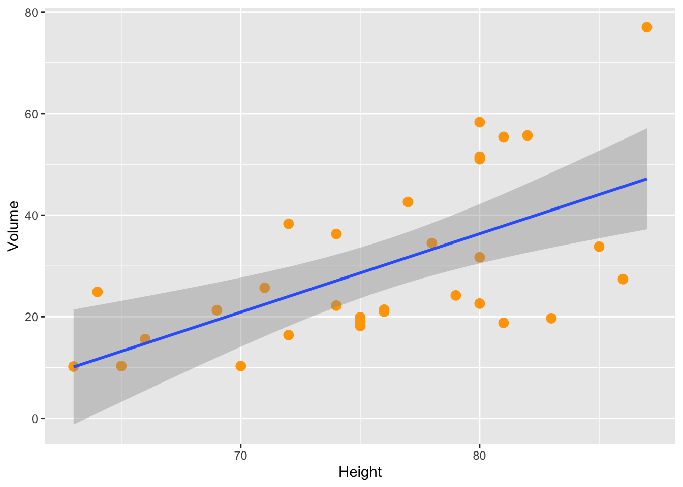
Change the display of your plot
theme_bw() is a popular choice.
trees %>% ggplot (aes(x=Height,y=Volume)) +
  geom_point(size=3,color="white") +
  geom_smooth(method="lm",color="pink") +
  theme_bw()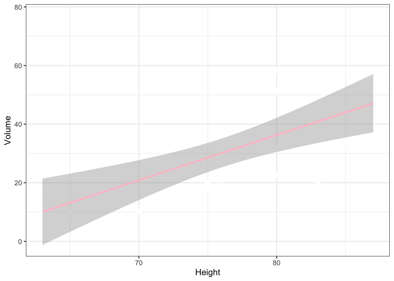
Another example with theme_dark().
trees %>% ggplot (aes(x=Height,y=Volume)) +
  geom_point(size=3,color="white") +
  geom_smooth(method="lm",color="pink") +
  theme_dark()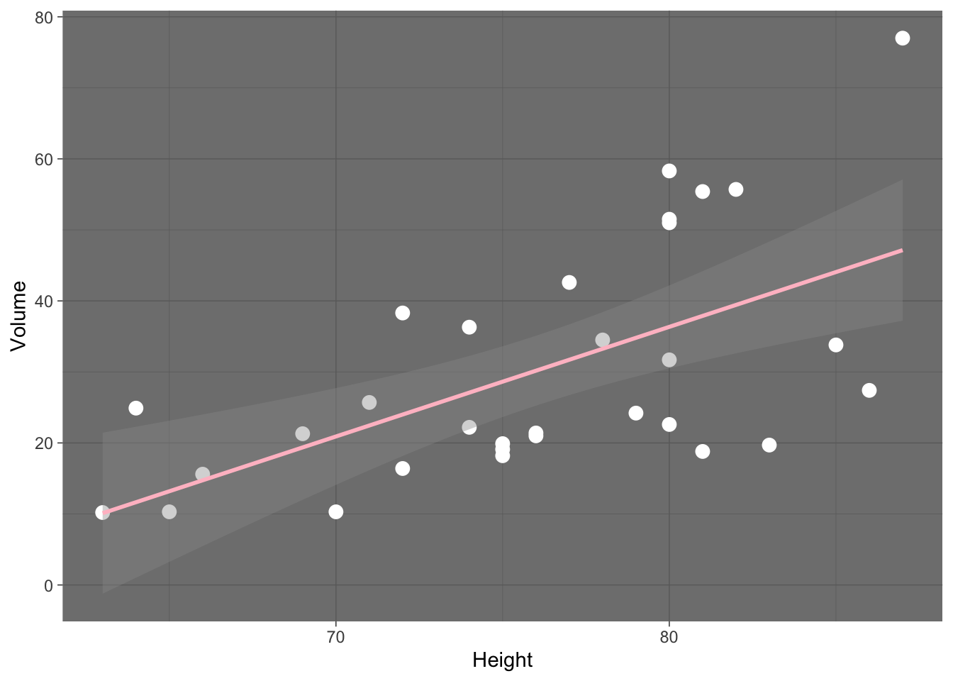
Different themes can be found here
Specify the labels and titles
trees %>% ggplot (aes(x=Height,y=Volume)) +
  geom_point(size=3) +
  geom_smooth(method="lm") +
  theme_bw() +
  xlab("my x-axis title") +
  ylab("my y-axis title") +
  ggtitle("My title")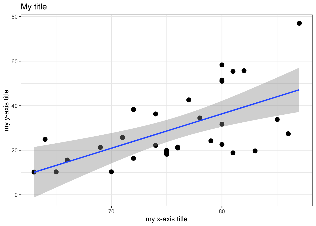
Increase the font size
trees %>% ggplot (aes(x=Height,y=Volume)) +
  geom_point(size=3) +
  geom_smooth(method="lm") +
  theme_bw() +
  xlab("x-axis title") +
  ylab("y-axis title") +
  ggtitle("Volume as a function of height") +
  theme(axis.text=element_text(size=13), # font size axis labels
        axis.title =element_text(size=15)) # # font size axis title and bold style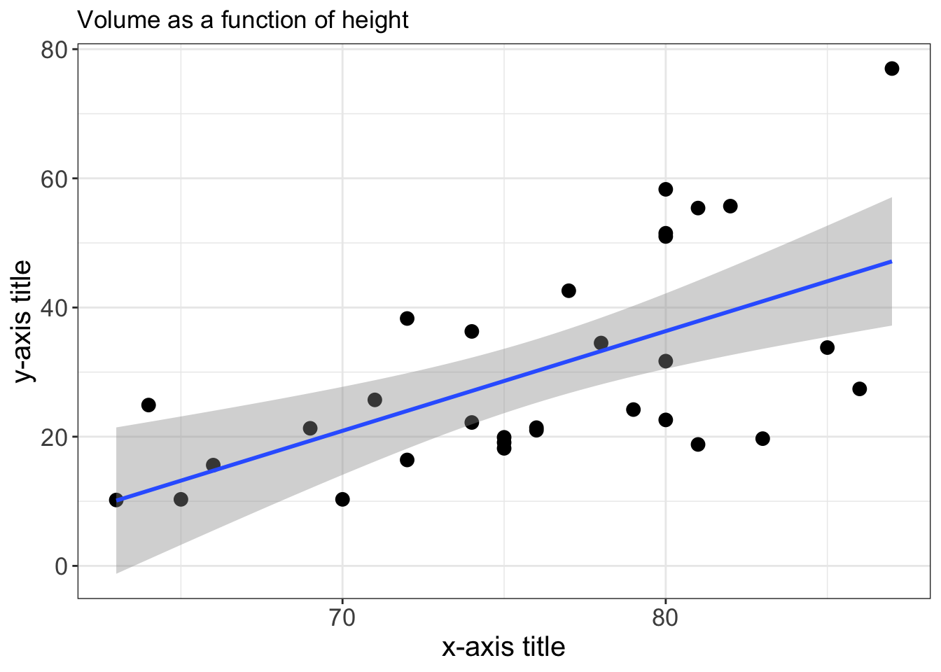
It’s time to discover other popular geoms. This nice cheat sheet describes many available geoms.
geom_boxplot
head(iris)## Sepal.Length Sepal.Width Petal.Length Petal.Width Species
## 1 5.1 3.5 1.4 0.2 setosa
## 2 4.9 3.0 1.4 0.2 setosa
## 3 4.7 3.2 1.3 0.2 setosa
## 4 4.6 3.1 1.5 0.2 setosa
## 5 5.0 3.6 1.4 0.2 setosa
## 6 5.4 3.9 1.7 0.4 setosadim(iris)## [1] 150 5str(iris)## 'data.frame': 150 obs. of 5 variables:
## $ Sepal.Length: num 5.1 4.9 4.7 4.6 5 5.4 4.6 5 4.4 4.9 ...
## $ Sepal.Width : num 3.5 3 3.2 3.1 3.6 3.9 3.4 3.4 2.9 3.1 ...
## $ Petal.Length: num 1.4 1.4 1.3 1.5 1.4 1.7 1.4 1.5 1.4 1.5 ...
## $ Petal.Width : num 0.2 0.2 0.2 0.2 0.2 0.4 0.3 0.2 0.2 0.1 ...
## $ Species : Factor w/ 3 levels "setosa","versicolor",..: 1 1 1 1 1 1 1 1 1 1 ...iris %>% ggplot(aes(x = Species, y = Sepal.Length)) +
geom_boxplot() +
theme_bw()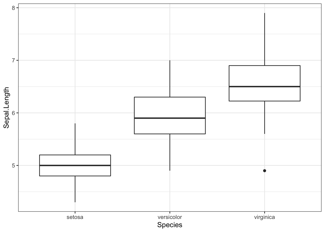
Use coord_flip() to flip the x-axis and the y-axis and change the color by group (species) by using color= in aes().
iris %>% ggplot(aes(x = Species, y = Sepal.Length,color=Species)) +
  geom_boxplot() +
  coord_flip() +
  theme_bw()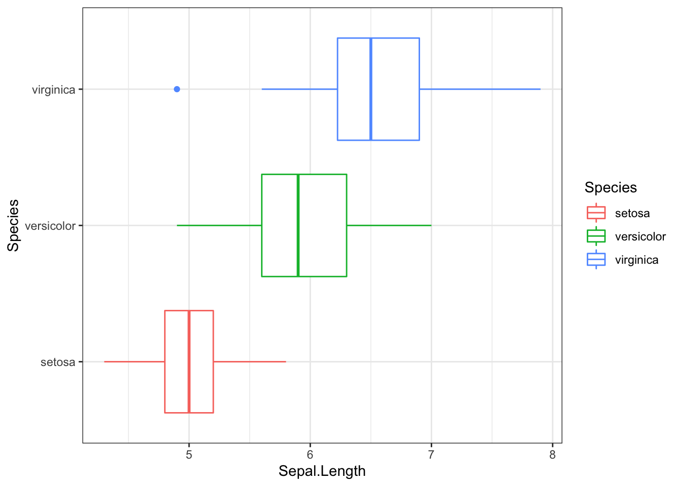
use fill= to add some colors
iris %>% ggplot(aes(x = Species, y = Sepal.Length,fill=Species)) +
  geom_boxplot() +
  coord_flip() +
  theme_bw()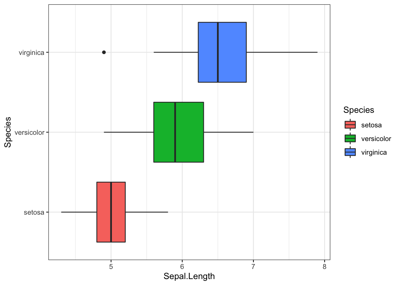
geom_histogram
library(gapminder)
head(gapminder)
## # A tibble: 6 x 6
## country continent year lifeExp pop gdpPercap
## <fct> <fct> <int> <dbl> <int> <dbl>
## 1 Afghanistan Asia 1952 28.8 8425333 779.
## 2 Afghanistan Asia 1957 30.3 9240934 821.
## 3 Afghanistan Asia 1962 32.0 10267083 853.
## 4 Afghanistan Asia 1967 34.0 11537966 836.
## 5 Afghanistan Asia 1972 36.1 13079460 740.
## 6 Afghanistan Asia 1977 38.4 14880372 786.dim(gapminder)## [1] 1704 6str(gapminder)## Classes 'tbl_df', 'tbl' and 'data.frame': 1704 obs. of 6 variables:
## $ country : Factor w/ 142 levels "Afghanistan",..: 1 1 1 1 1 1 1 1 1 1 ...
## $ continent: Factor w/ 5 levels "Africa","Americas",..: 3 3 3 3 3 3 3 3 3 3 ...
## $ year : int 1952 1957 1962 1967 1972 1977 1982 1987 1992 1997 ...
## $ lifeExp : num 28.8 30.3 32 34 36.1 ...
## $ pop : int 8425333 9240934 10267083 11537966 13079460 14880372 12881816 13867957 16317921 22227415 ...
## $ gdpPercap: num 779 821 853 836 740 ...- lifeExp = life expectancy at birth
- pop = total population
- gdpPercap = per-capita GDP (Gross domestic product)
ggplot(gapminder, aes(x = lifeExp)) +
geom_histogram(binwidth = 1) # binwidth = think in term of the unit of the x variable. Choose the binwidth consciously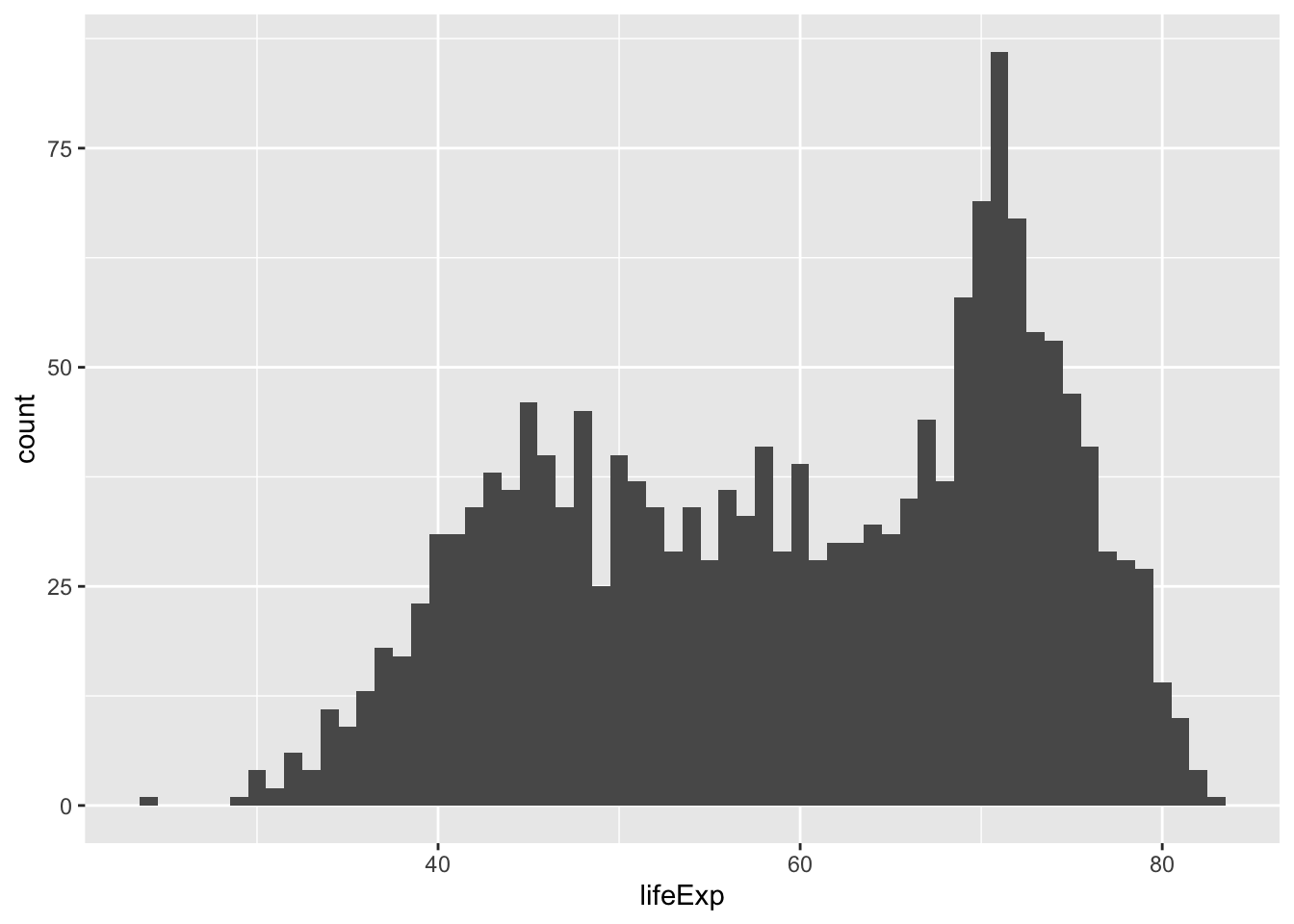
ggplot(gapminder, aes(x = lifeExp)) +
geom_histogram(binwidth = 20) # bin width = think in term of the unit of the x variable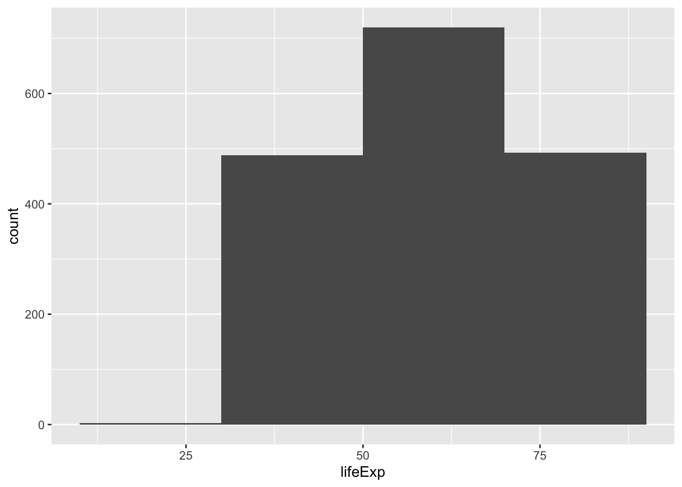
Differentiate by continent and change the theme
ggplot(gapminder, aes(x = lifeExp, fill = continent)) +
geom_histogram(binwidth = 1) +
  theme_bw()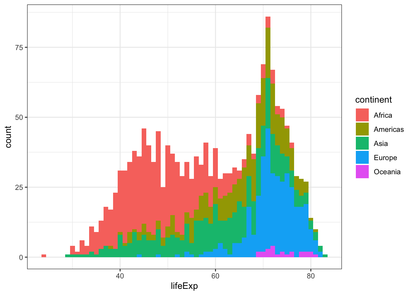
geom_line
gapminder %>% filter (continent %in% c("Europe","Americas")) %>%
  ggplot( aes(x=year,y=lifeExp,group=country)) +
  geom_line() +
  theme_bw()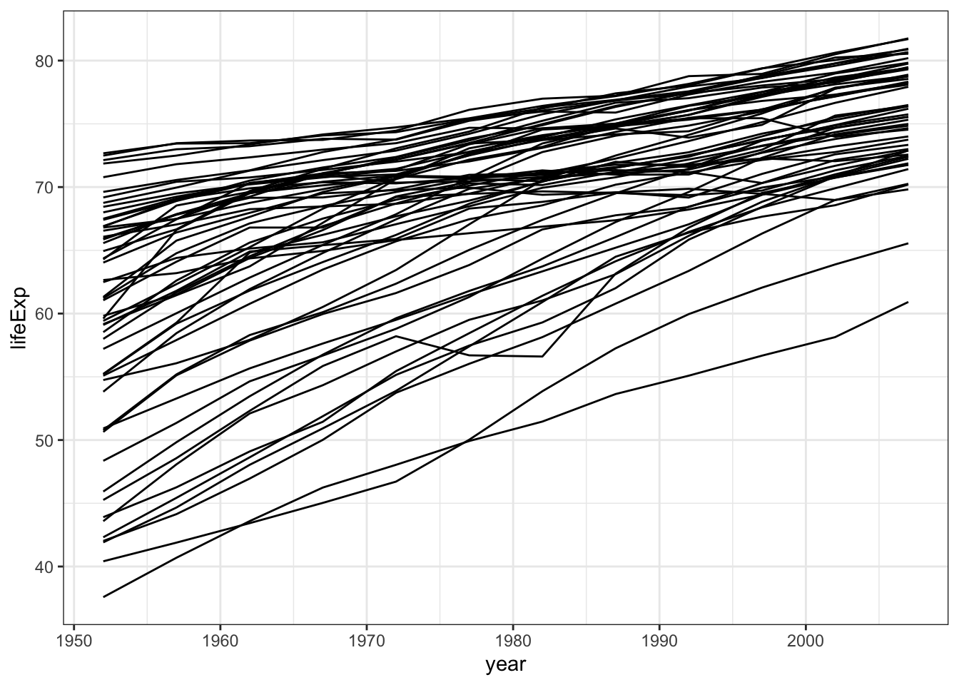
By plotting all the countries using group=country you get a spaghetti plot that does not look great. A way to improve your plot is to use facet_wrap (facetting). You can also highlight one specific line Learn more watching this nice R talk
** facetting**
gapminder %>% filter(continent %in% c("Europe","Americas")) %>%
  ggplot(aes(x=year,y=lifeExp,group=country)) +
  geom_line() +
  theme_bw() +
  facet_wrap(~country)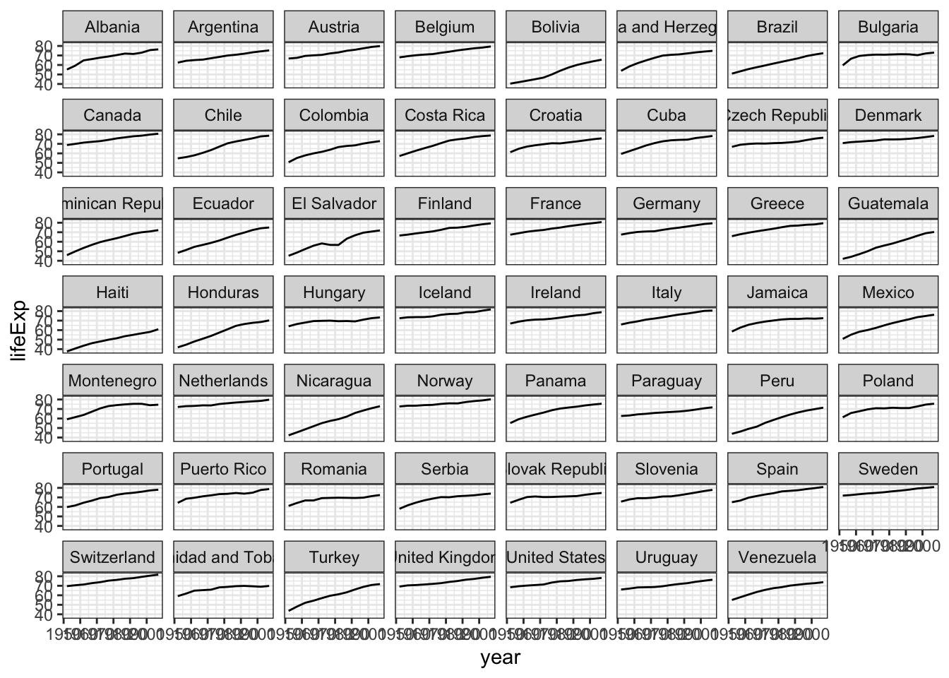
gapminder %>%filter (continent %in% c("Europe","Americas")) %>%
  ggplot(aes(x=year,y=lifeExp,group=country)) +
  geom_line() +
  theme_bw() +
  facet_wrap(~country,scale="free_y")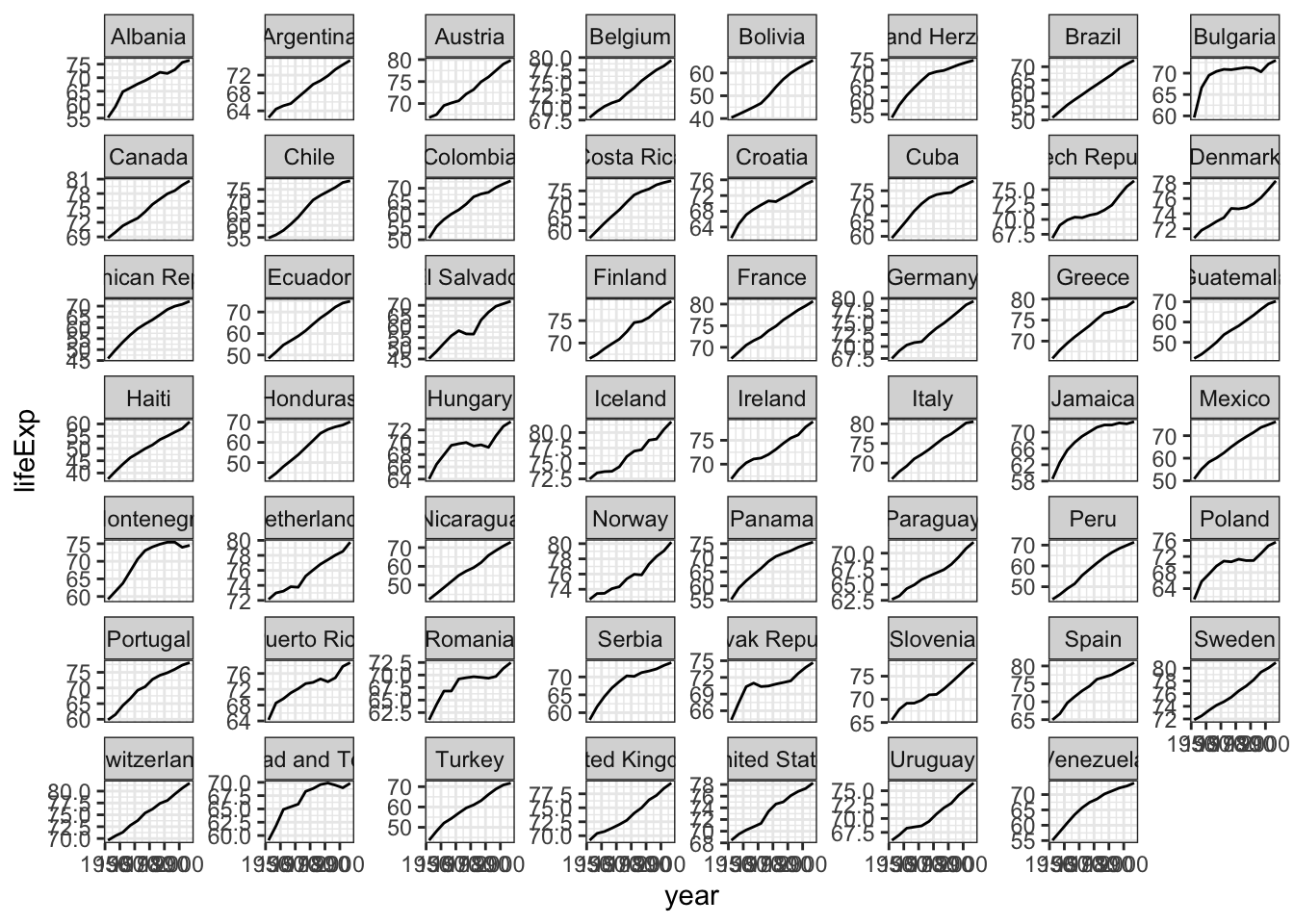
gapminder %>%
  ggplot(aes(x=year,y=lifeExp,group=country)) +
  geom_line() +
  theme_bw() +
  facet_wrap(~continent,scale="free_y")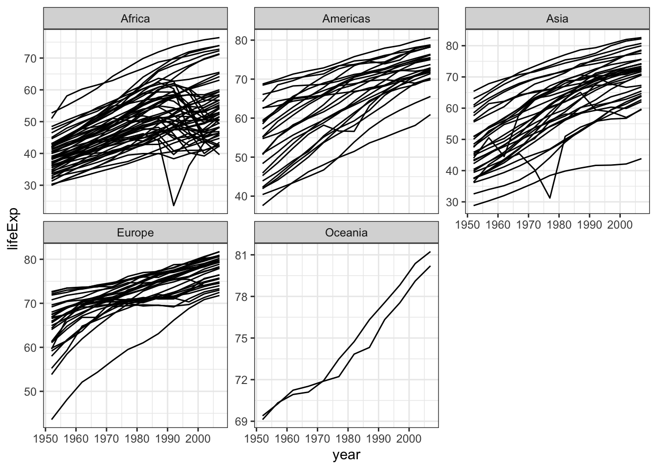
highlight one specific country
France <- gapminder %>% filter(country=="France")
gapminder %>% filter (continent %in% c("Europe","Americas")) %>%
  ggplot( aes(x=year,y=lifeExp)) +
  geom_line(aes(x=year,y=lifeExp,group=country),colour="grey") +
  geom_line(aes(x=year,y=lifeExp), data = France,colour="red") +
theme_bw() 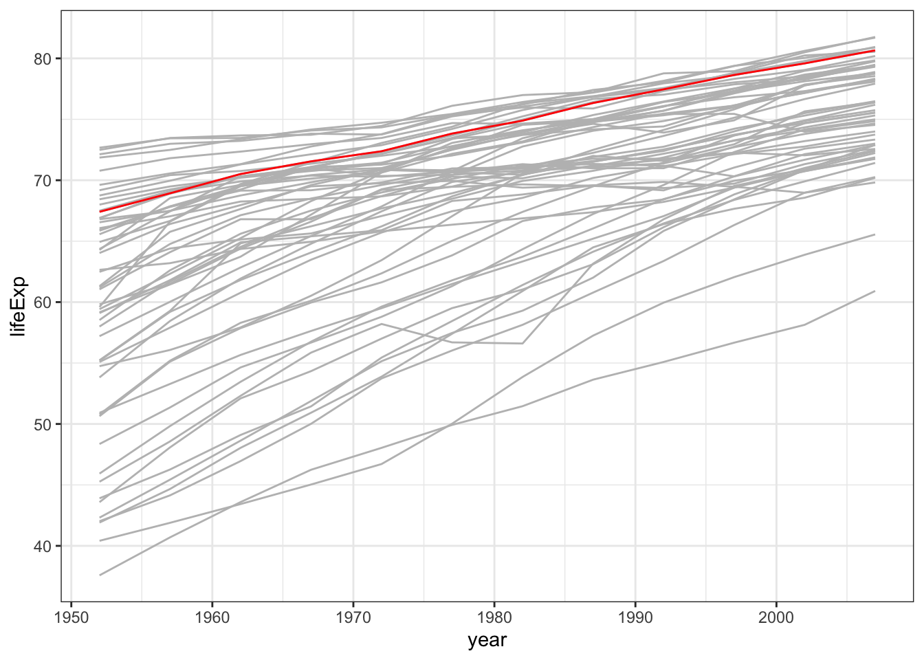
Bar chart
gapminder %>% filter(year==2002 & continent== "Europe") %>%
  ggplot(aes(x = country, y = lifeExp)) +
  geom_bar(stat="identity",     # statistical transformation to use on the data
           position="identity", # position adjustment
           fill="grey")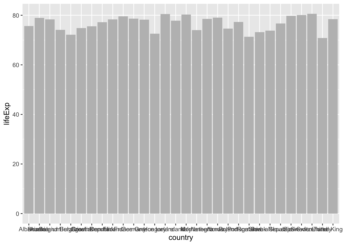
if stat="identity", the heights of the bar represent values in the data
if stat="bin" (by default), the height of each bar equal to the number of cases in each group, and it is incompatible with mapping values to the y aesthetic.
We can improve this graph by:
* modifying the position of x-axis labels
* adapting the y-axis scale
* adding axis title
* ordering the countries by increasing life expectancy
gapminder %>% filter(year==2002 & continent== "Europe") %>%
  ggplot(aes(x = reorder(country,lifeExp), y = lifeExp)) +
  geom_bar(stat="identity",
           position="identity",
           fill="steelblue") +
  coord_cartesian(ylim=c(70,85)) +
  theme_bw() +
  theme(axis.text.x = element_text(angle = 90, hjust = 1), # vertical x-axis labels
        axis.text=element_text(size=12), # font size axis labels
        axis.title =element_text(size=12)) +
  labs(title="Life expectancy in 2002",
       subtitle = "Case study of Europe")+
ylab("Life expectancy") 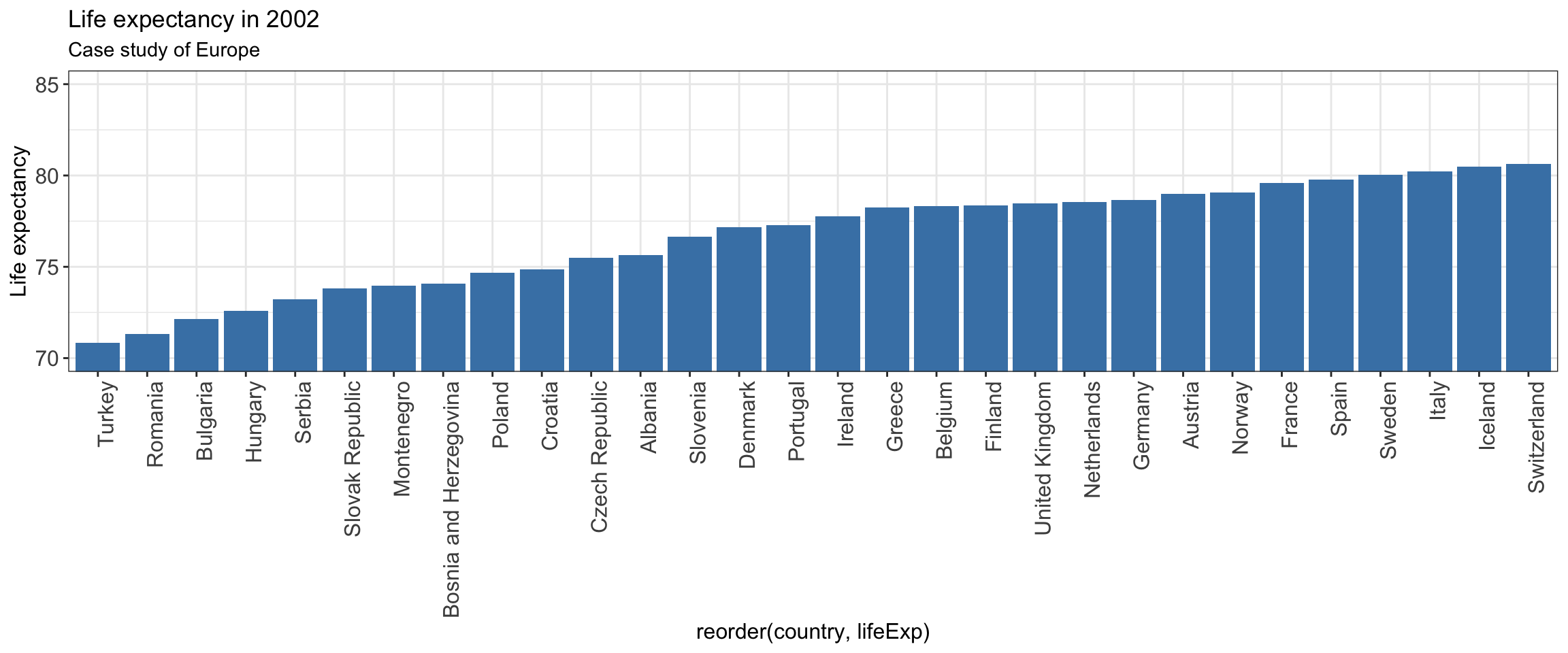
group bar chart
gapminder %>% filter(year == 1967 | year == 2007) %>%
  filter (country %in% c("Peru","Argentina")) %>%
  ggplot(aes(x = country, y = lifeExp,  fill=as.factor(year))) +
  geom_bar(stat="identity",
           position="dodge") +
  ylab("Life expectancy") +
  theme_bw() +
  scale_fill_manual(values = c("#1380A1","#FAAB18")) +
  theme(axis.text=element_text(size=13), # font size axis labels
axis.title =element_text(size=15)) 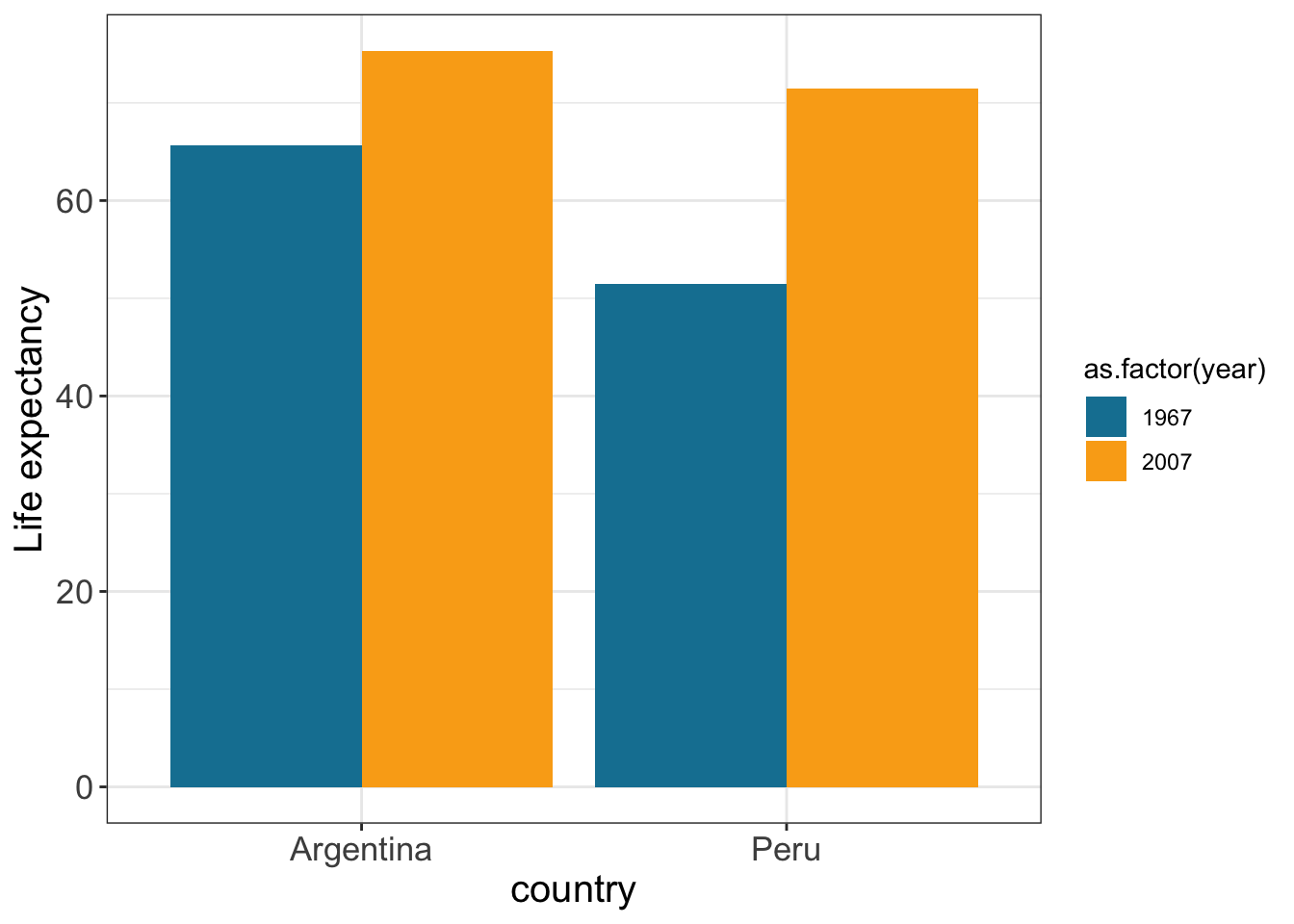
position="dodge" adjust position by dodging overlaps to the side
Change the legend
gapminder %>% filter(year == 1967 | year == 2007) %>%
  filter (country %in% c("Peru","Argentina")) %>%
  ggplot(aes(x = country, y = lifeExp,  fill=as.factor(year))) +
  geom_bar(stat="identity",
           position="dodge") +
  scale_fill_manual(values = c("#1380A1", "#FAAB18"),name="year") + # name of the legend
  ylab("Life expectancy") +
  xlab("") +
  theme_bw() +
  theme(axis.text=element_text(size=13), # font size axis labels
        axis.title =element_text(size=15),
        legend.text=element_text(size=14),
        axis.title.x = element_blank(),
        legend.position="bottom",   # legend position
legend.direction="horizontal") # legend direction 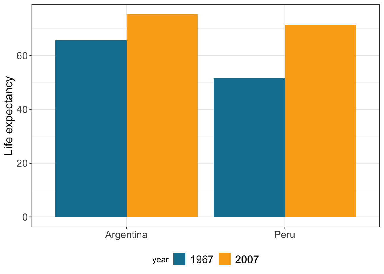
# legend.title = element_blank()) # if you want to remove legend title Label the outliers using geom_text
We can spot some decline in life expectancy in Africa and Asia around 90’s ans 70’s, respectively
gapminder %>% ggplot( aes(x=year,y=lifeExp,group=country)) +
  geom_line() +
  facet_wrap(~continent,scale="free_y") +
  theme_bw()
gapminder %>% ggplot( aes(x=year,y=lifeExp,group=country)) +
  geom_line() +
  facet_wrap(~continent,scale="free_y") +
  theme_bw() +
  geom_text(aes(x = year, y = lifeExp, label=country),
            data = gapminder %>% filter(lifeExp < 40))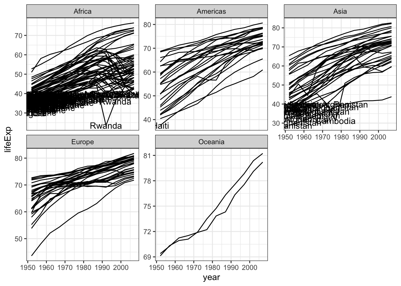
When youn use geom_text, the filter is really important
gapminder %>% ggplot( aes(x=year,y=lifeExp,group=country)) +
  geom_line() +
  facet_wrap(~continent,scale="free_y") +
  theme_bw() +
  geom_text(aes(x = year, y = lifeExp, label=country),
            data = gapminder %>% filter(lifeExp < 32 & year > 1970 & year < 1995))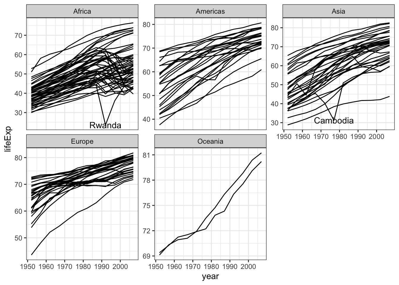
Visualizing time: time series
Example with the data set nasa (part of the GGaly package) it consists of atmospheric measurements across a grid of locations in Middle America
data(nasa, package="GGally")
head(nasa)
## time y x lat long date cloudhigh cloudlow cloudmid ozone
## 1 1 1 1 -21.2 -113.8000 1995-01-01 0.5 31.0 2.0 260
## 2 1 1 2 -21.2 -111.2957 1995-01-01 1.5 31.5 2.5 260
## 3 1 1 3 -21.2 -108.7913 1995-01-01 1.5 32.5 3.5 260
## 4 1 1 4 -21.2 -106.2870 1995-01-01 1.0 39.0 4.0 258
## 5 1 1 5 -21.2 -103.7826 1995-01-01 0.5 48.0 4.5 258
## 6 1 1 6 -21.2 -101.2783 1995-01-01 0.0 50.0 2.5 258
## pressure surftemp temperature id day month year
## 1 1000 297.4 296.9 1-1 0 1 1995
## 2 1000 297.4 296.5 2-1 0 1 1995
## 3 1000 297.4 296.0 3-1 0 1 1995
## 4 1000 296.9 296.5 4-1 0 1 1995
## 5 1000 296.5 295.5 5-1 0 1 1995
## 6 1000 296.5 295.0 6-1 0 1 1995For each observational unit, we have multiple measurements
nasa %>% filter(x == 1, y == 1) %>%
  ggplot(aes(x = time, y = temperature)) +
  geom_point() +
  theme_bw()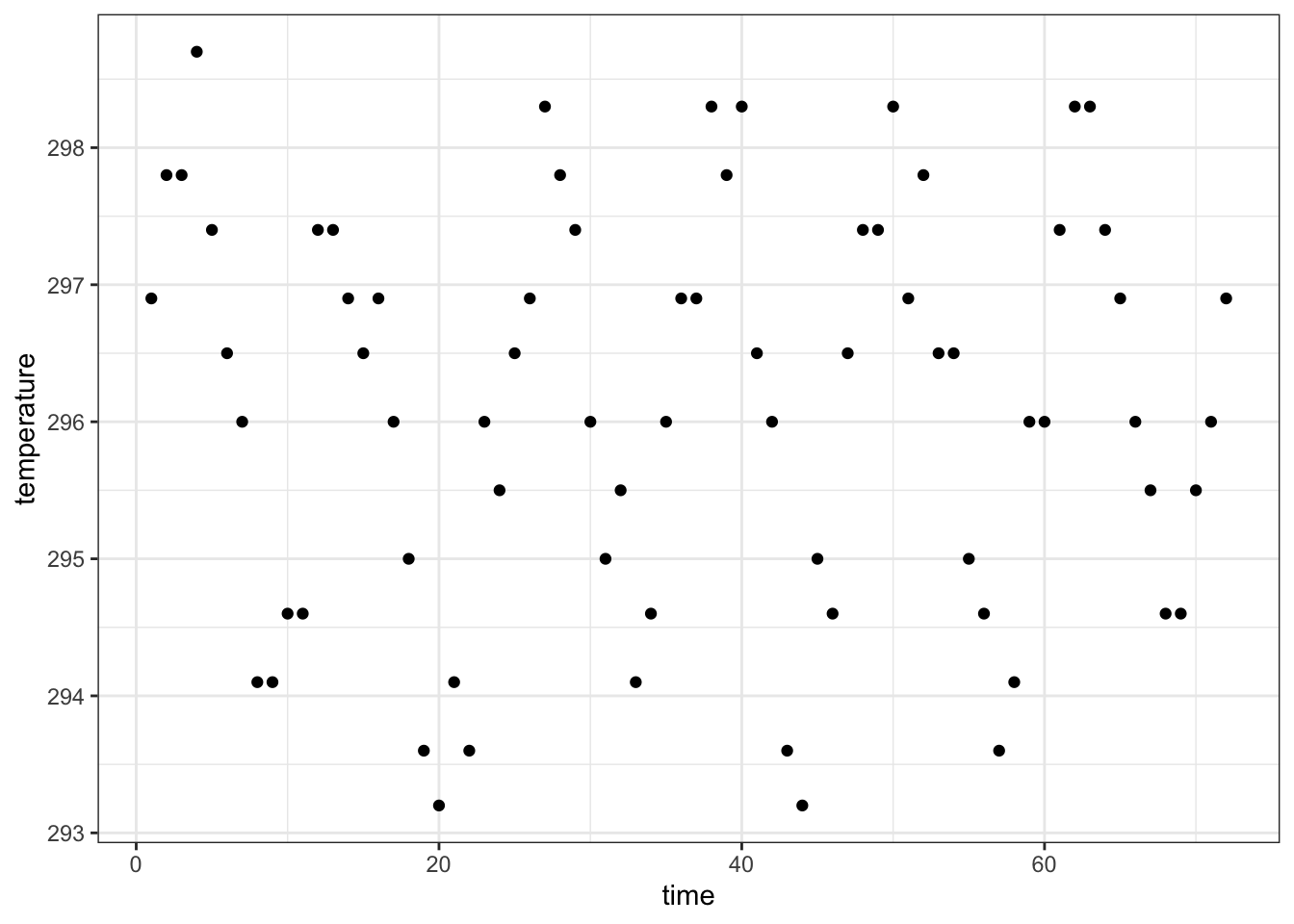
We connect the multiple measurements by a line
nasa %>% filter(x == 1, y == 1) %>%
  ggplot(aes(x = time, y = temperature)) +
  geom_line() +
  theme_bw()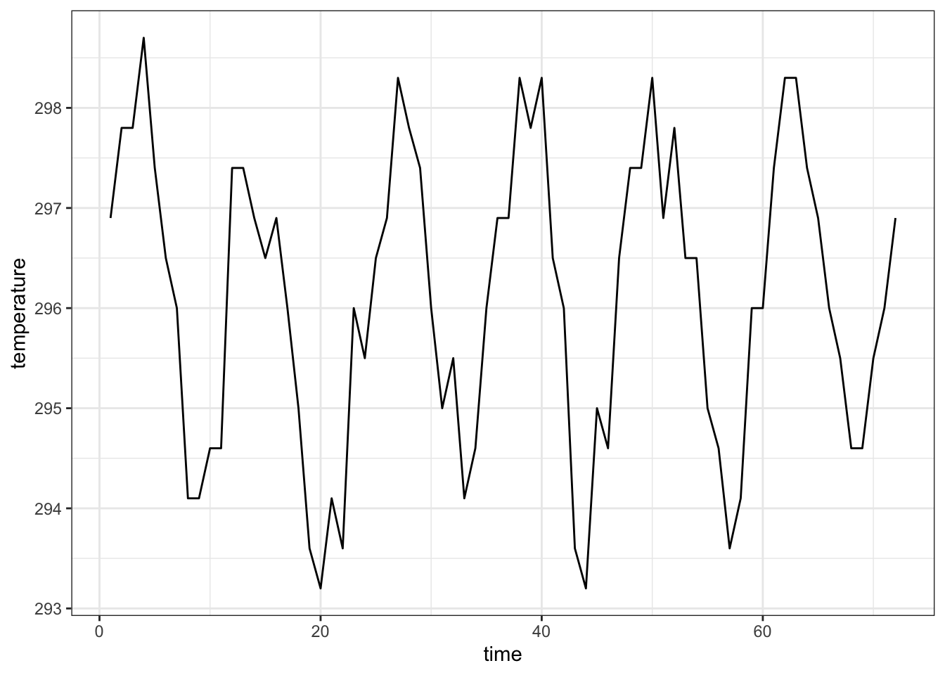
Each observational unit forms a group, we only connect points within a group by a line
nasa %>% filter(x == 1, y %in% c(1, 10)) %>% head(n=6) # how look the data## time y x lat long date cloudhigh cloudlow cloudmid ozone
## 1 1 1 1 -21.20000 -113.8 1995-01-01 0.5 31.0 2.0 260
## 2 1 10 1 1.26087 -113.8 1995-01-01 0.5 43.5 4.0 248
## 3 2 1 1 -21.20000 -113.8 1995-02-01 1.0 33.5 3.0 254
## 4 2 10 1 1.26087 -113.8 1995-02-01 1.0 28.5 5.5 246
## 5 3 1 1 -21.20000 -113.8 1995-03-01 2.0 25.5 4.0 254
## 6 3 10 1 1.26087 -113.8 1995-03-01 1.5 12.5 3.5 254
## pressure surftemp temperature id day month year
## 1 1000 297.4 296.9 1-1 0 1 1995
## 2 1000 297.8 298.3 1-10 0 1 1995
## 3 1000 298.7 297.8 1-1 31 2 1995
## 4 1000 298.7 300.1 1-10 31 2 1995
## 5 1000 298.3 297.8 1-1 59 3 1995
## 6 1000 297.4 299.2 1-10 59 3 1995nasa %>% filter(x == 1, y %in% c(1, 10)) %>%
ggplot(aes(x = time, y = temperature, group=id)) +
geom_line() +
theme_bw()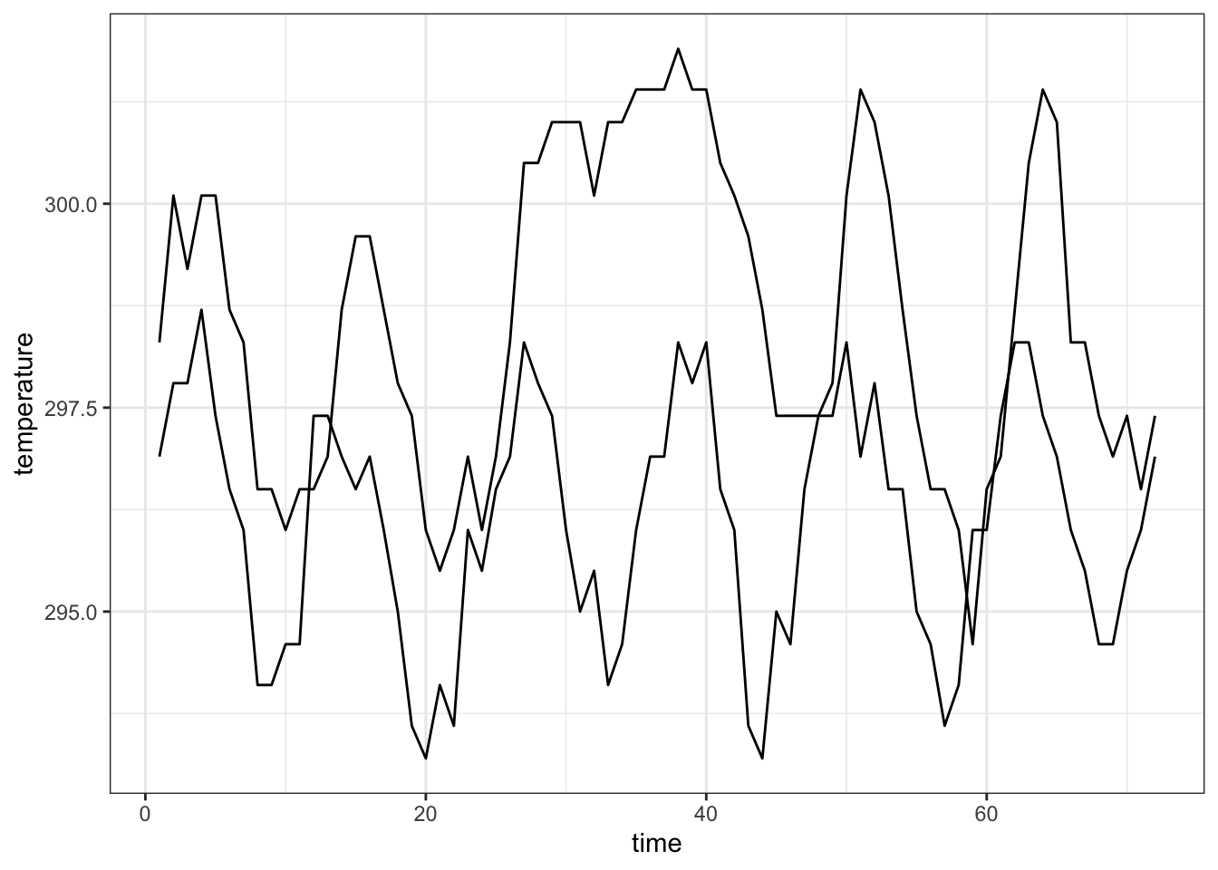
Connect points with a line
nasa %>% filter(x == 1, y %in% c(1, 10)) %>%
  ggplot(aes(x = time, y = temperature, group=id)) +
  geom_point() +
  geom_line() +
  theme_bw()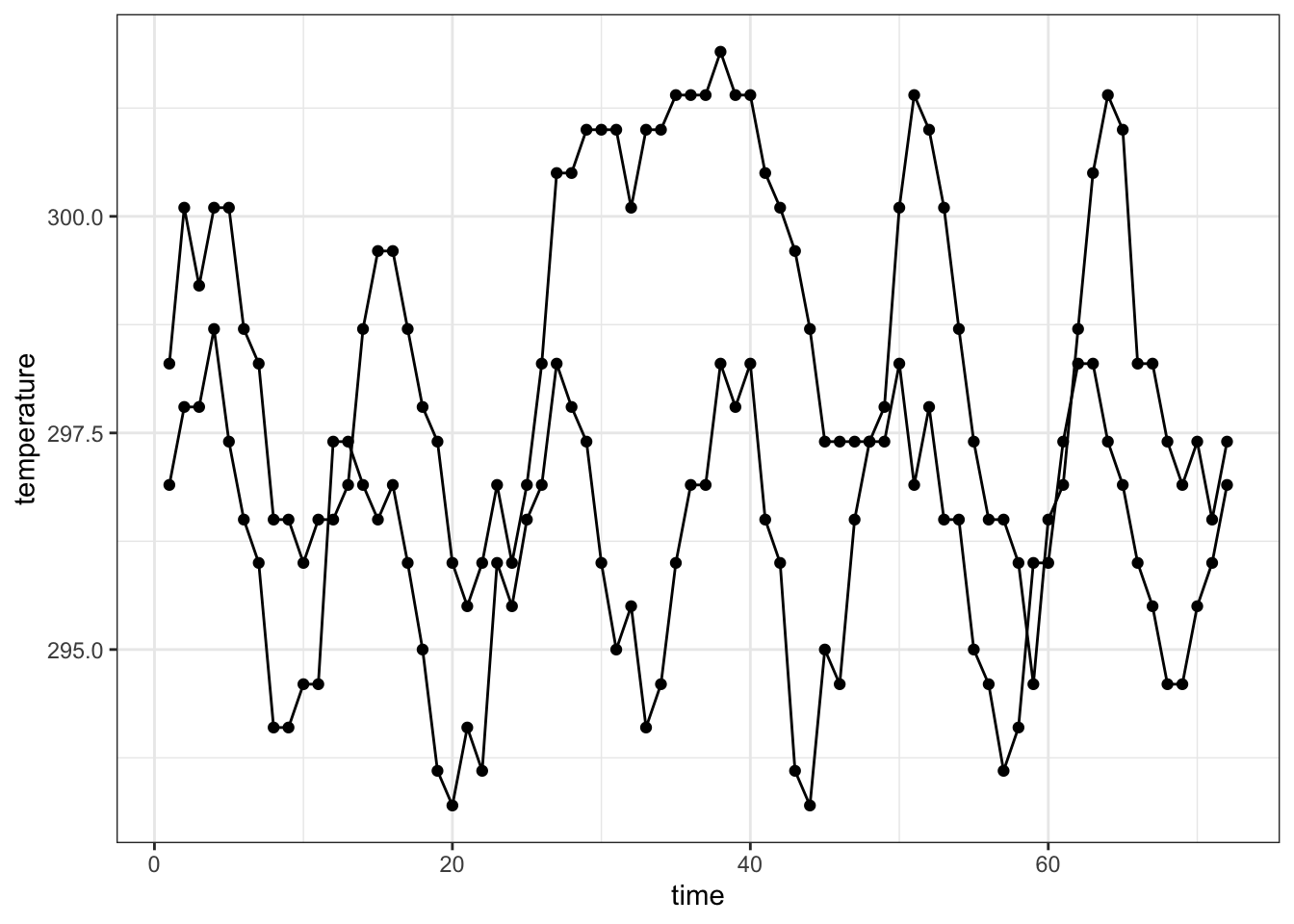
Customise color, size and shape
Use scale_color_manual, scale_size_manual and scale_shape_manual
iris %>% ggplot(aes(x = Sepal.Width, y = Sepal.Length,color=Species)) +
   geom_point() +
  theme_bw()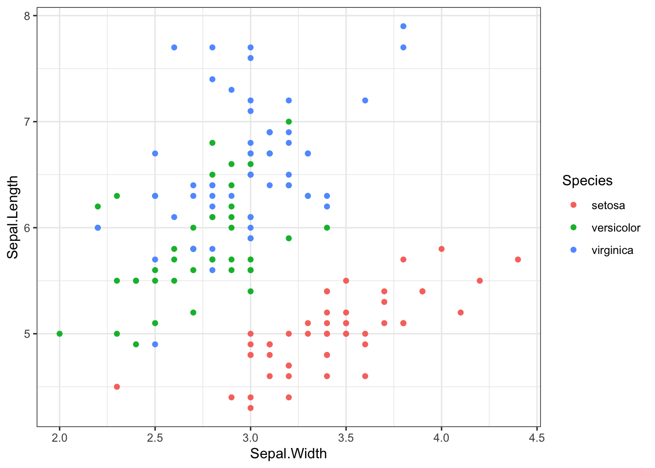
scale_color_manual to change point colors
useful website: https://www.color-hex.com/
iris %>% ggplot(aes(x = Sepal.Width, y = Sepal.Length,color=Species)) +
   geom_point() +
   theme_bw() +
   scale_color_manual(values=c("#666547","#fb2e01","#6fcb9f"))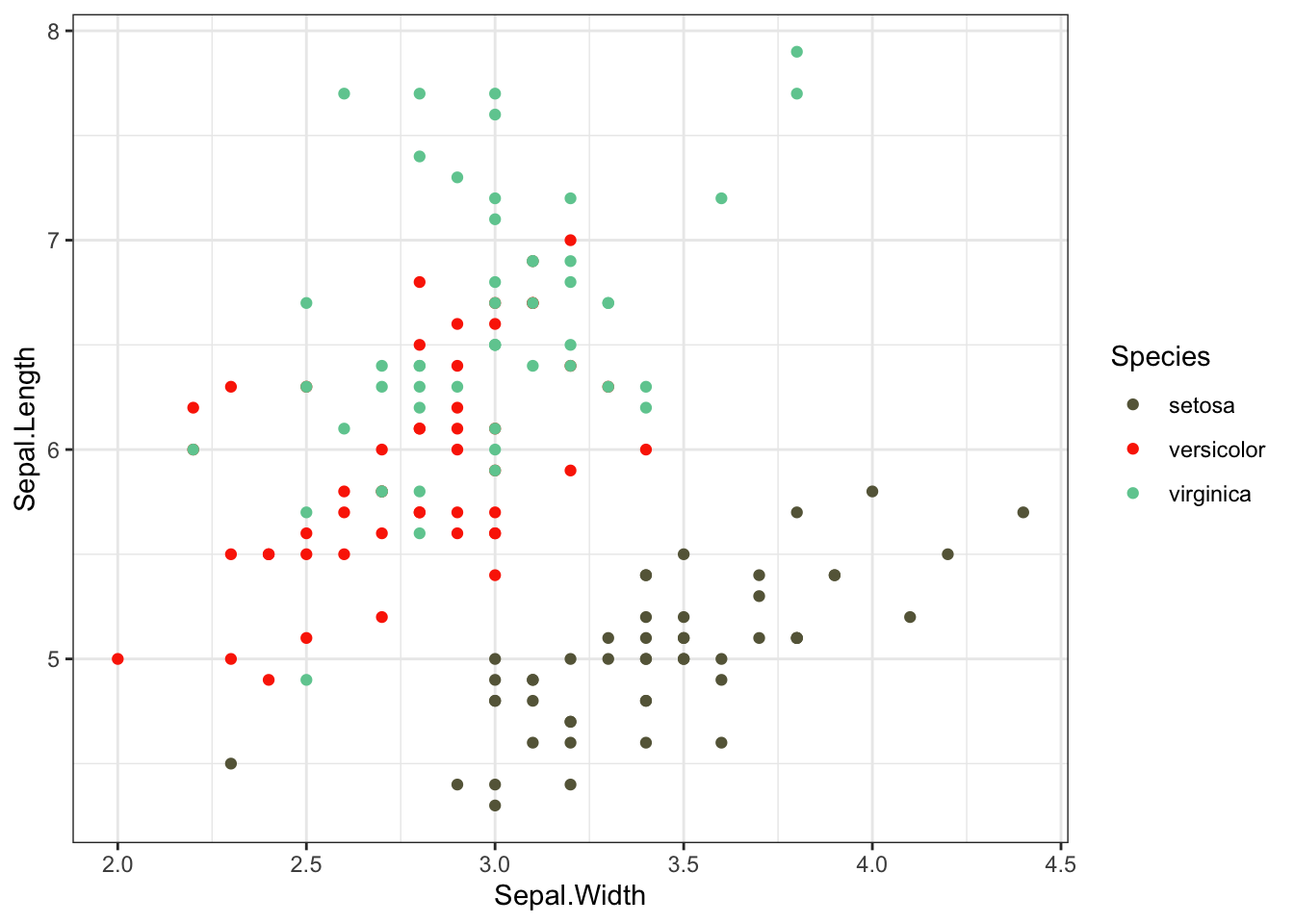
scale_size_manual to change point sizes
iris %>% ggplot(aes(x = Sepal.Width, y = Sepal.Length,size=Species)) +
   geom_point() +
   theme_bw() +
   scale_size_manual(values=c(2,2,5))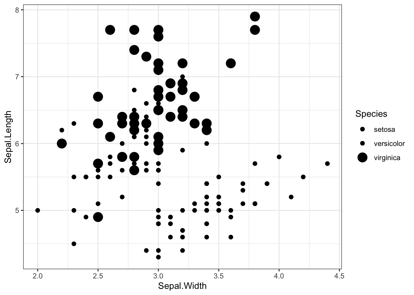
iris %>% ggplot(aes(x = Sepal.Width, y = Sepal.Length,size=Petal.Length)) +
   geom_point() +
theme_bw() 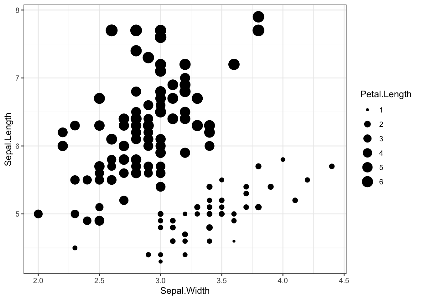
scale_shape_manual to change point shapes
iris %>% ggplot(aes(x = Sepal.Width, y = Sepal.Length,shape=Species)) +
   geom_point() +
   theme_bw() +
   scale_shape_manual(values=c(19,17,15))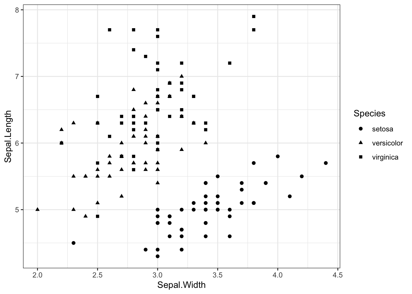
combine different sets of mapping
iris %>% ggplot(aes(x = Sepal.Width, y = Sepal.Length,shape=Species,color=Species,size=Petal.Width)) +
  geom_point() +
  theme_bw() +
  scale_shape_manual(values=c(19,17,15)) +
scale_color_manual(values=c("#e37d78","#8bc6c4","#17a37f")) 
Change your axis scale
iris %>% ggplot(aes(x = Sepal.Width, y = Sepal.Length,shape=Species,color=Species,size=Petal.Width)) +
  geom_point() +
  theme_bw() +
  scale_shape_manual(values=c(19,17,15)) +
  scale_color_manual(values=c("#e37d78","#8bc6c4","#17a37f")) +
  scale_x_continuous(limits =c(0,5))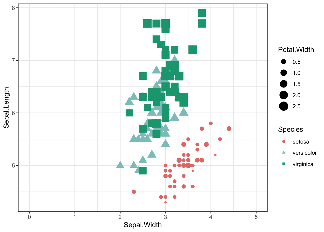
iris %>% ggplot(aes(x = Sepal.Width, y = Sepal.Length,shape=Species,color=Species,size=Petal.Width)) +
  geom_point() +
  theme_bw() +
  scale_shape_manual(values=c(19,17,15)) +
  scale_color_manual(values=c("#e37d78","#8bc6c4","#17a37f")) +
  scale_x_continuous(breaks = seq(2, 5, by = 0.5))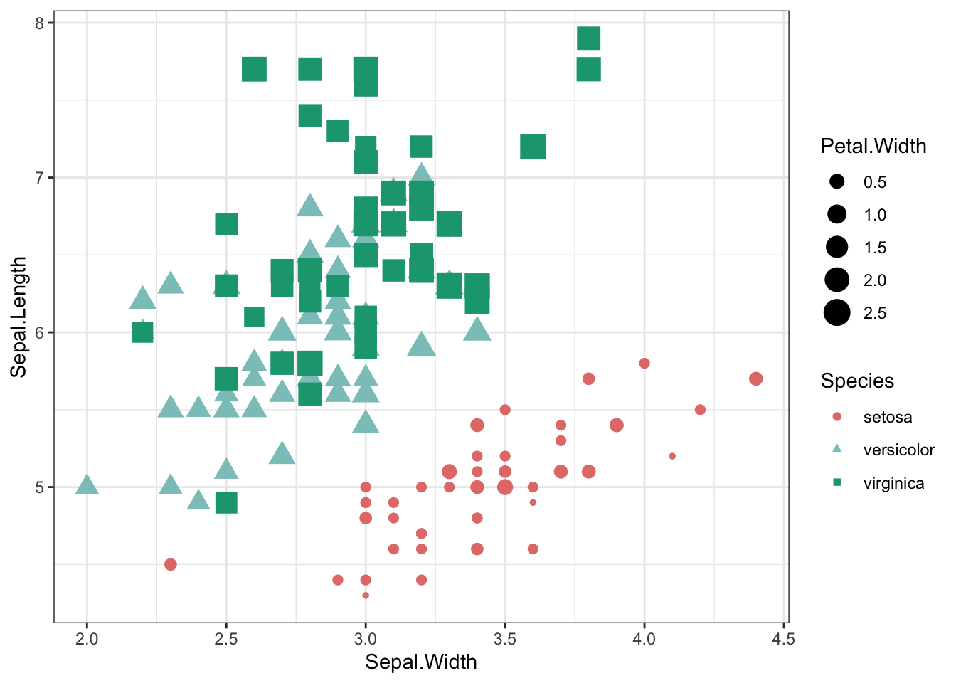
seq(2, 5, by = 0.5)## [1] 2.0 2.5 3.0 3.5 4.0 4.5 5.0arrange multiple plots
you need the package ggpubr
p1<-trees %>% ggplot (aes(x=Height,y=Volume)) +
  geom_point(size=2,color="orange") + # no confidence interval displayed
  geom_smooth(method="lm",se=FALSE,color="black") +
  ggtitle("linear regression")

p2<-trees %>% ggplot (aes(x=Height,y=Volume)) +
  geom_point(size=2,color="orange") + # no confidence interval displayed
  geom_smooth(method="loess",se=FALSE,color="black") +
  ggtitle("loess regression")


library(ggpubr)
## Loading required package: magrittr##
## Attaching package: 'magrittr'## The following object is masked from 'package:purrr':
##
## set_names## The following object is masked from 'package:tidyr':
##
## extractggarrange(p1,p2,ncol=1,nrow=2)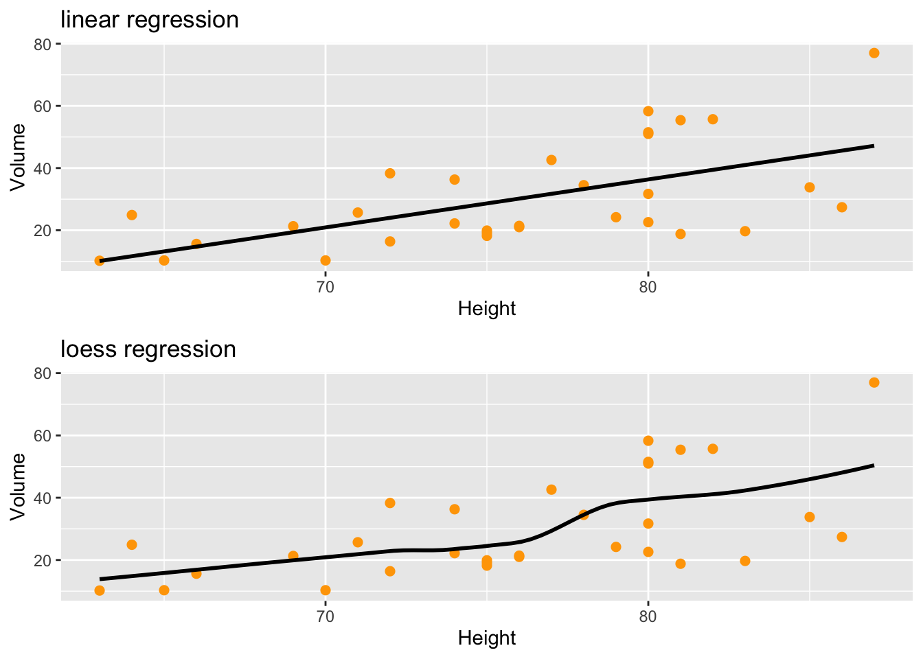
ggarrange(p1,p2,ncol=2,nrow=1)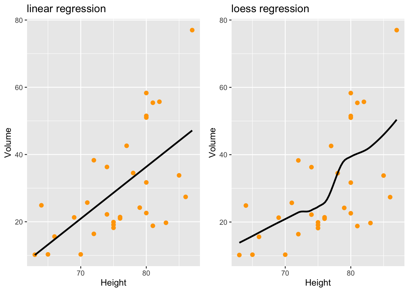
save your graphics
setwd(“~/Documents/Dossier1/Figures/”) ggsave(“nameofyourgraphic.pdf”)
ggsave(“nameofyourgraphic.pdf”,width=6,height=7) # adjust the size