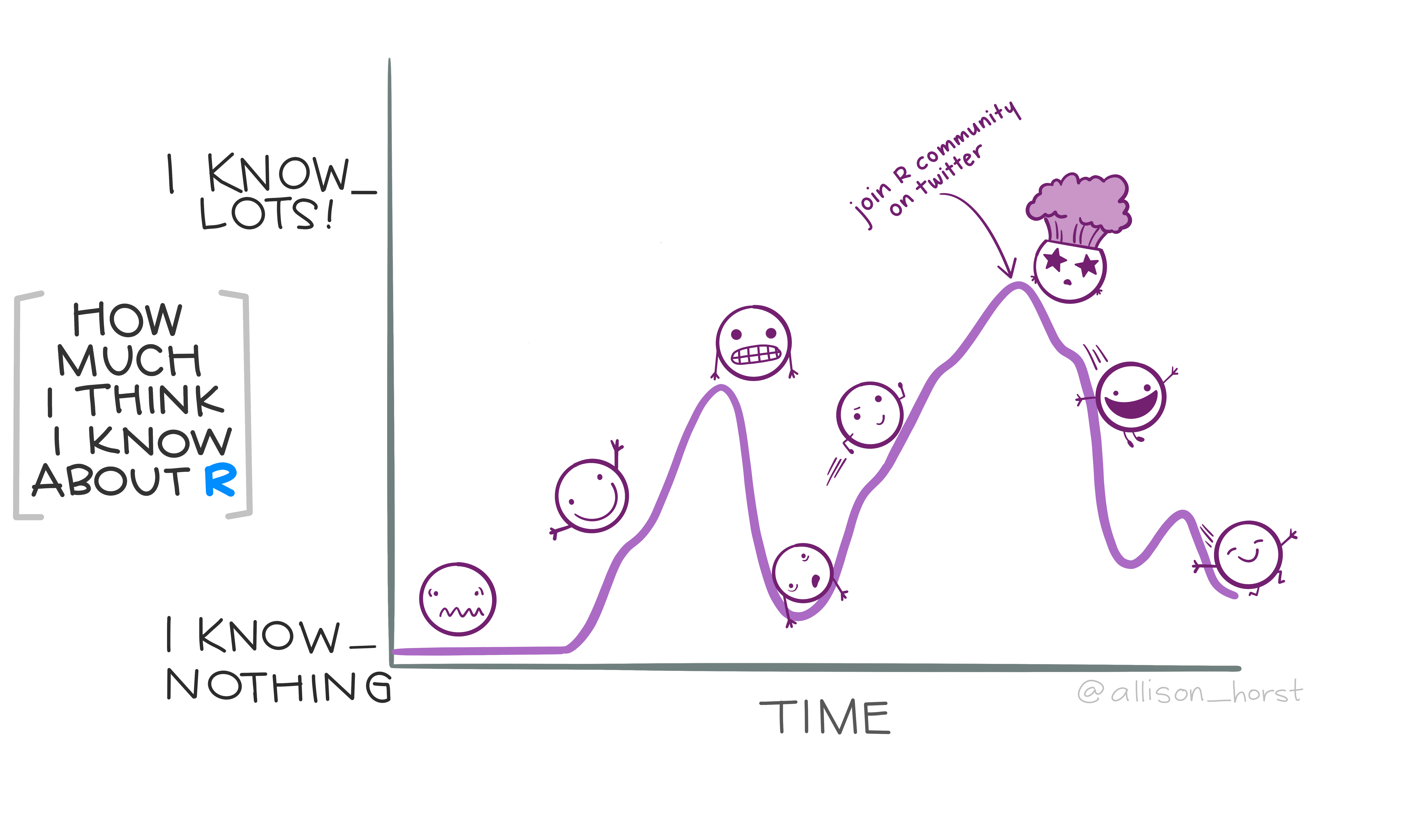
Disclaimer
This workshop does not provide code but all the plots were made using R Studio (see last slides for more details)
Visualizing quantity : bar plot

Visualizing quantity : bar plot
What's wrong with this plot?
Visualizing quantity : bar plot
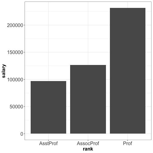
- Avoid abbreviations
- Precise axis title + unit
- Make it more attractive
Visualizing quantity : bar plot
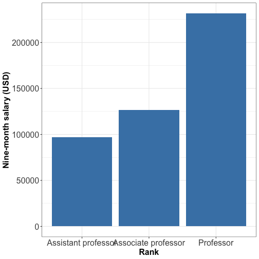
Visualizing quantity : bar plot
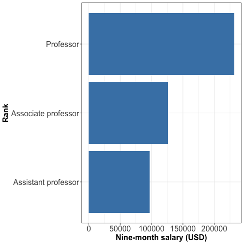
For long x-axis labels, flip the the axis
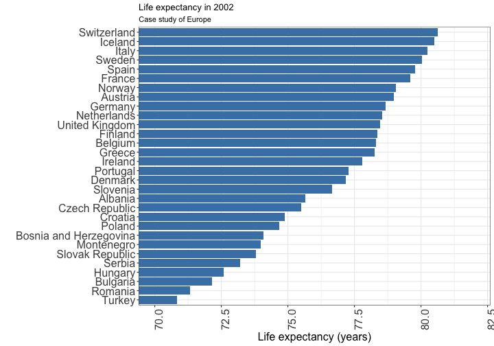
Visualizing quantity: bar plot
Order the categories by ascending or descending values
Keep categories naturally ordered like age group
For long labels: flip the axis
Visualizing quantity : grouped bar plot
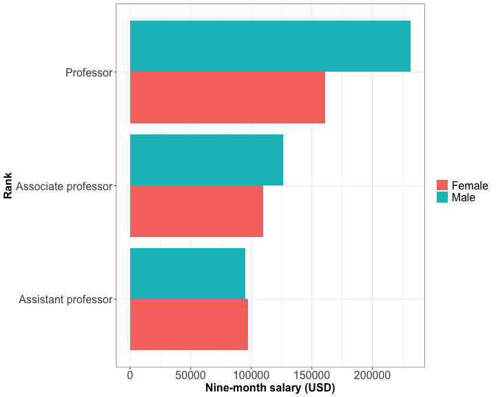
Useful to draw bars within each group according to another other categorical variable
What's wrong with this plot?
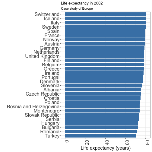
What's wrong with this plot?
- bars are too long
- Can be impractical sometimes
Don't do that! 🙅
Don't do that! 🙅
- Bars charts start at zero. Indeed, the bar length is proportional to the amount displayed.
- dot plot is a better option
Visualizing quantity: dot plot
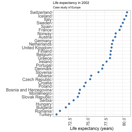
Visualizing quantity: dot plot
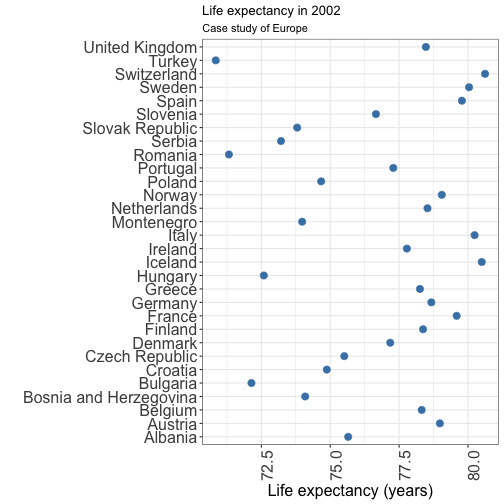
Visualizing quantity: dot plot
Bars charts or dot plot: the order matters
Here, you don't deliver a clear message
Visualizing quantity : lollipop plot
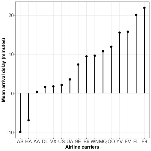
Database: On-time data for all flights that departed NYC
Lollipop plots are an alternative for simple barchart
Visualizing distribution : histograms
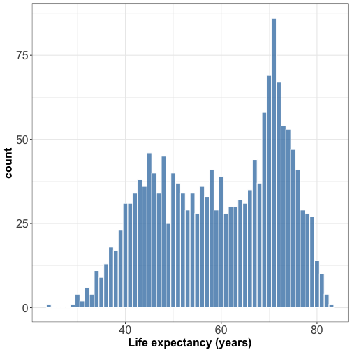
Histogram are useful for plotting the distribution of a single quantitative variable
Visualizing distribution : histograms
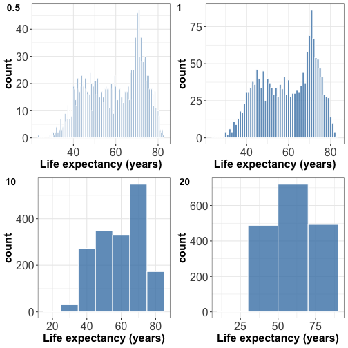
Try different bin widths for best visual appearance.
Small bin width -> peaky and busy histogram
Large bin width -> features might disappear
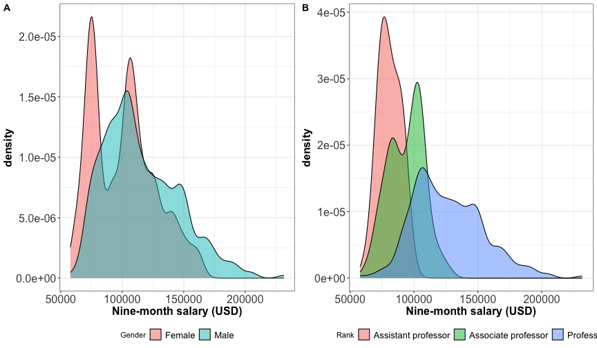
Visualizing distribution : density plot
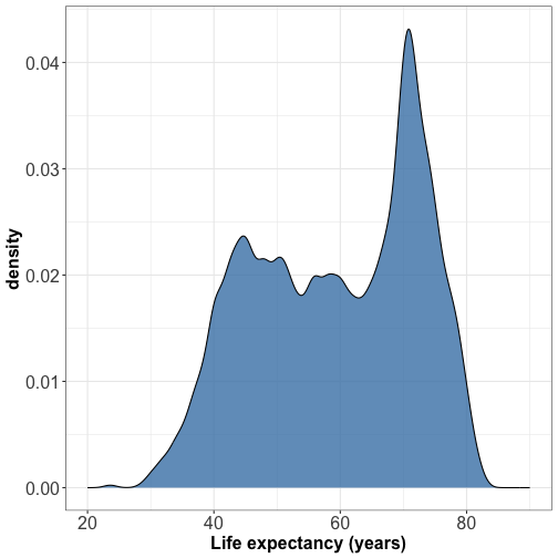
Visualizing distribution : density plot
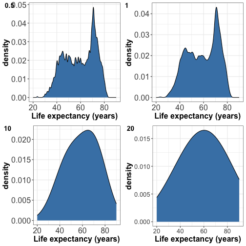
Try different bandwidths for best visual appearance
Small bandwidth -> peaky and busy density
Large bandwidth -> smooth feature and might look like a gaussian
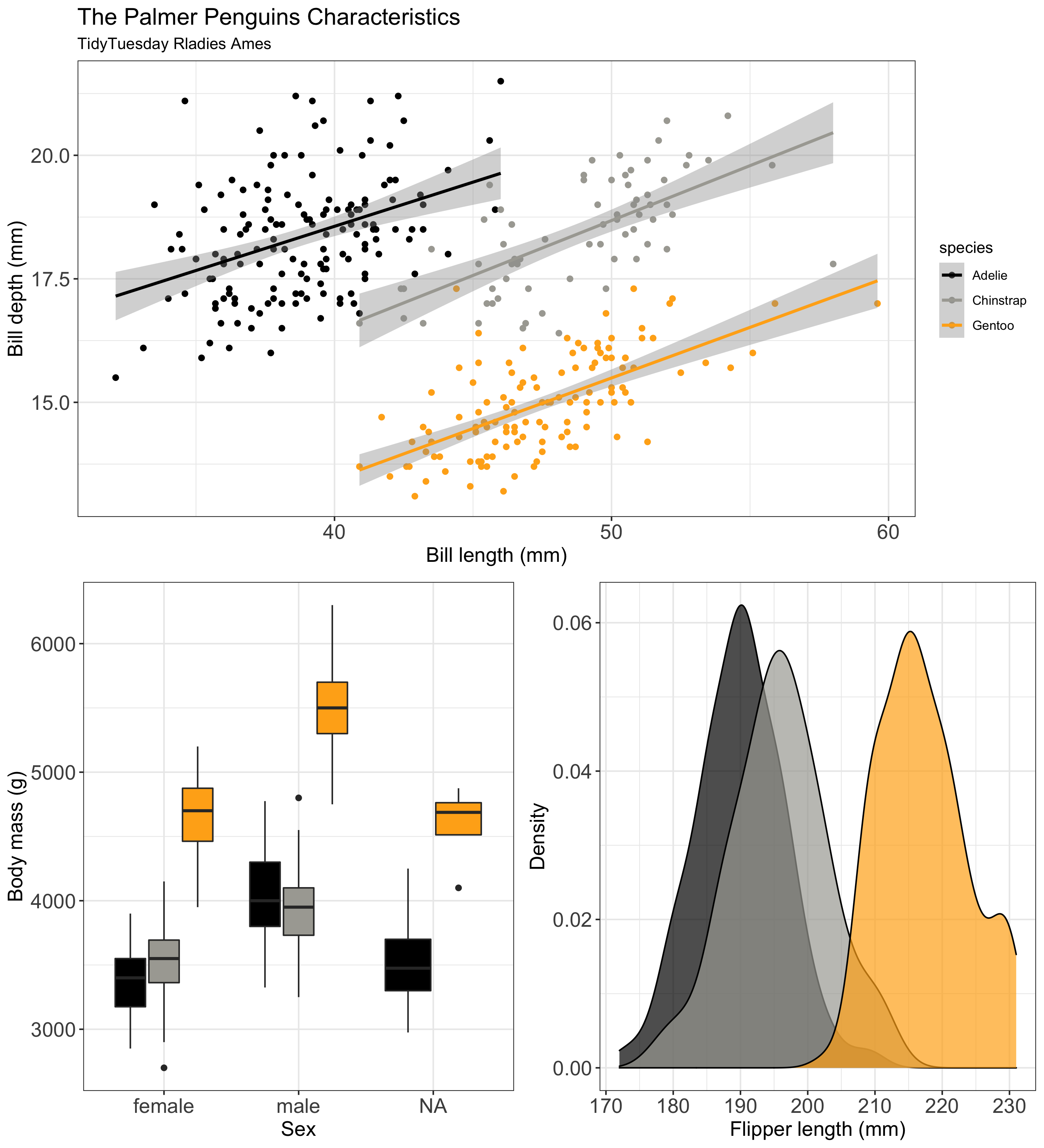
Visualizing multiple distributions
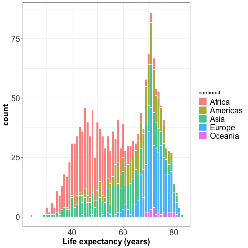
Visualizing multiple distributions
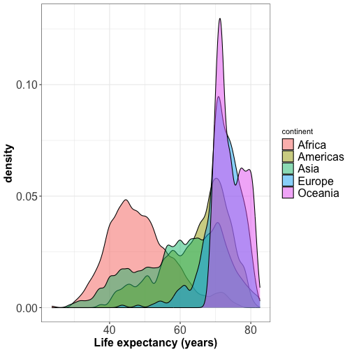
The peaks of the density plot are where there is the highest concentration of points
For several distributions, density plots work better than histograms.
Visualizing multiple distributions
Visualizing multiple distributions: ridgeline plot
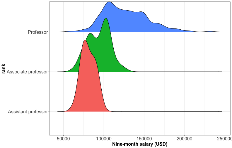
Visualizing multiple distributions: ridgeline plot
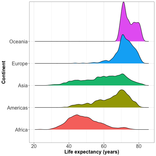
Ridgeline plot shows the distribution of a numeric value for several groups (at least 5-6 groups) or when they overlap each other.
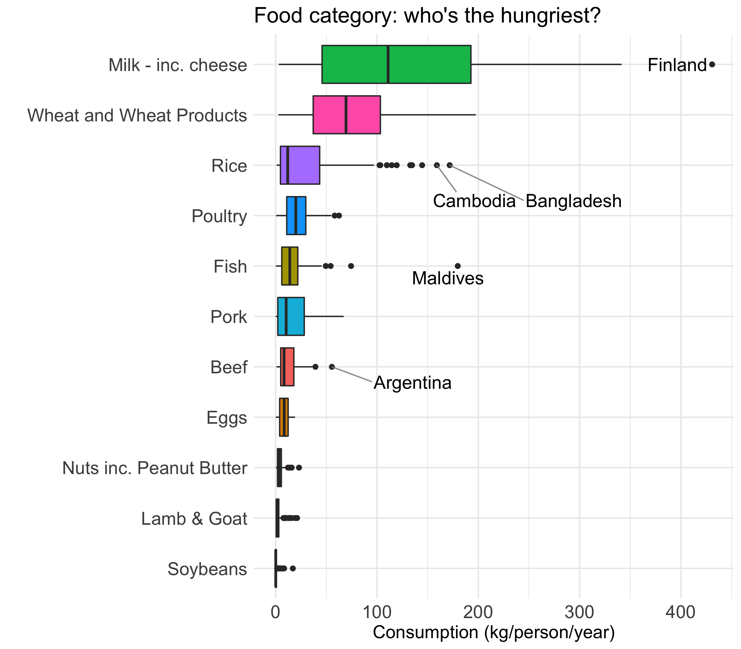
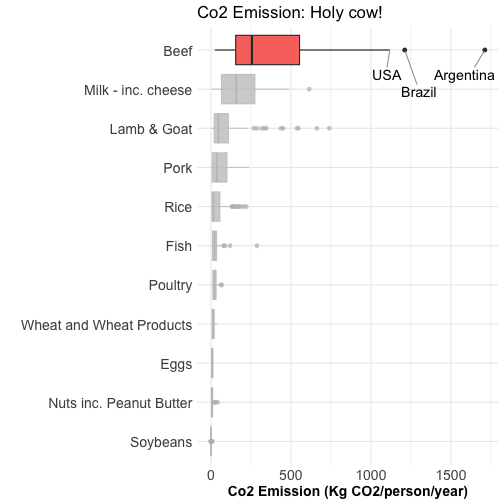
Visualizing distributions: boxplot
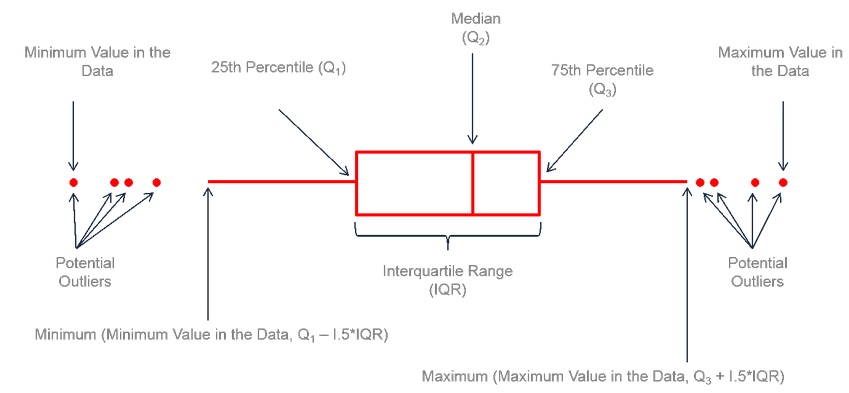
A boxplot can summarize the distribution of a numeric variable for several groups
Visualizing distributions: boxplot
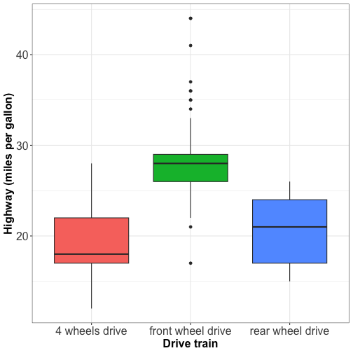
Boxplot does not tell about the number of observations.
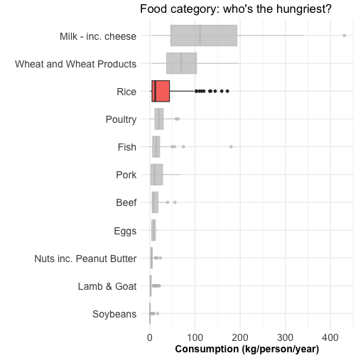
Visualizing distributions: boxplot with jitter
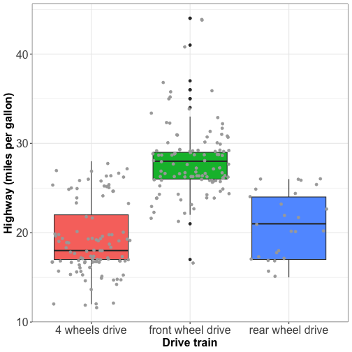
Boxplots with jitter tell about:
the distribution of the data
if the groups are balanced or unbalanced in terms of observations.
Visualizing distributions: boxplot with jitter
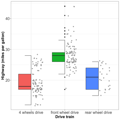
No overlapping facilitates the visual appearence of the plot
Visualizing distributions: violin plot
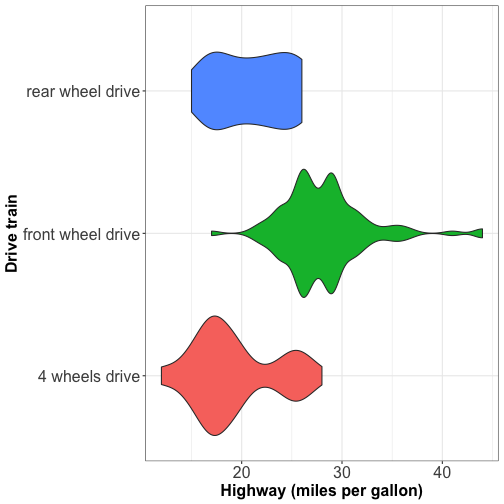
Violins are equivalent to density estimate
They are useful to represent bimodal data.
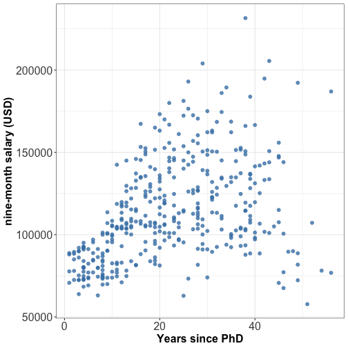
Relationship between 2 numeric variables: scatterplot
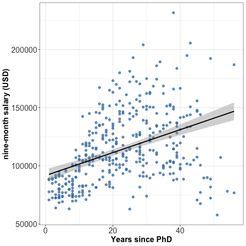
Relationship between 2 numeric variables: scatterplot + linear fit
Relationship between 2 numeric variables: scatterplot + quadratic fit
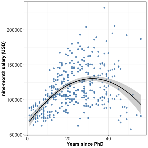
⚠️ Linear fit is widely used but it is not always the best fit, try quadratic fit too.
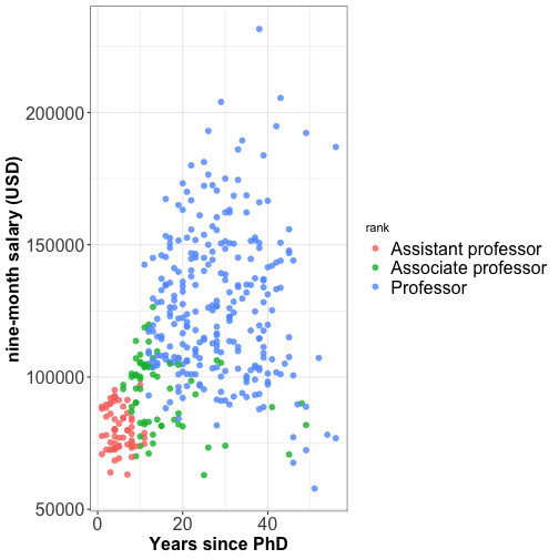
Relationship between 2 numeric variables: scatterplot
Multi-panel plots
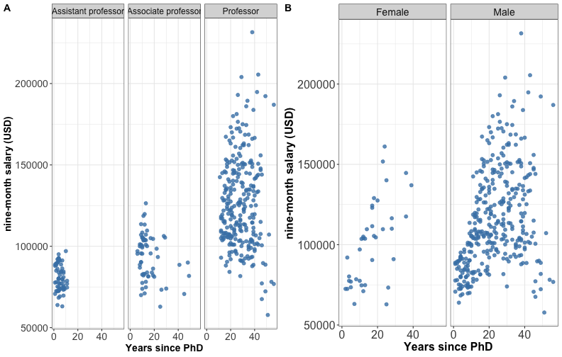
Split a single plot using one variable with many levels
Multi-panel plots
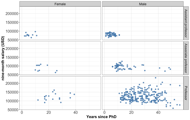
Split a single plot using the combinations of two discrete variables.
Multi-panel plots
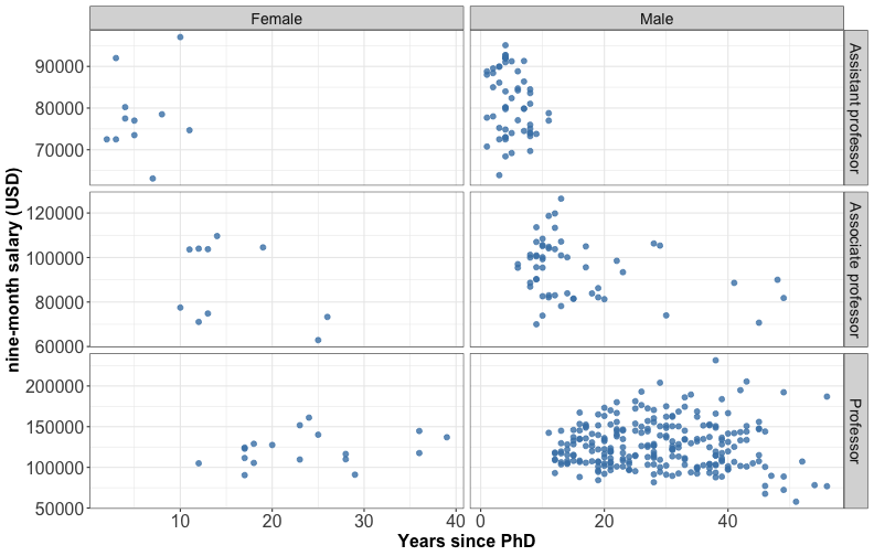
⚠️ different scales can lead to misinterpretation
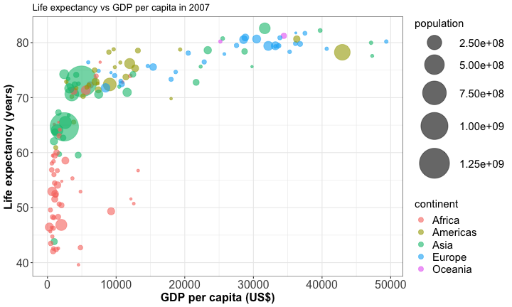
Bubble plot
A bublle plot is a scatterplot with 3 numerical variables
Hexagonal heatmap
It counts the number of cases in each hexagon. Useful for large dataset or avoid overplotting.
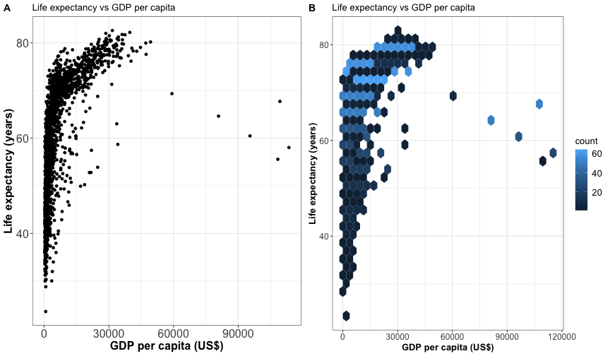
Computationally more efficient than plotting individual data points for very large dataset.
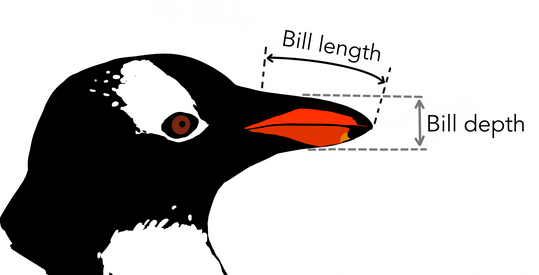
Your turn 👨💻
| species | island | bill_length_mm | bill_depth_mm | flipper_length_mm |
|---|---|---|---|---|
| Adelie | Torgersen | 39.1 | 18.7 | 181 |
| Adelie | Torgersen | 39.5 | 17.4 | 186 |
| Adelie | Torgersen | 40.3 | 18.0 | 195 |
| Adelie | Torgersen | NA | NA | NA |
| Adelie | Torgersen | 36.7 | 19.3 | 193 |
Your turn 👩💻
| species | island | body_mass_g | sex | year |
|---|---|---|---|---|
| Adelie | Torgersen | 3750 | male | 2007 |
| Adelie | Torgersen | 3800 | female | 2007 |
| Adelie | Torgersen | 3250 | female | 2007 |
| Adelie | Torgersen | NA | NA | 2007 |
| Adelie | Torgersen | 3450 | female | 2007 |
Visualizing time series
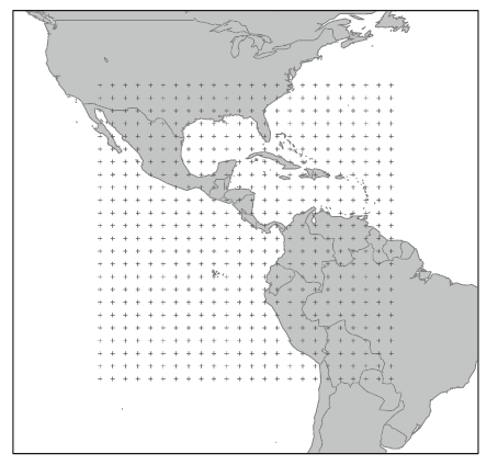
Example with a NASA dataset: atmospheric measurements across a grid of locations in Central America (Murrell, 2010)
Visualizing time series
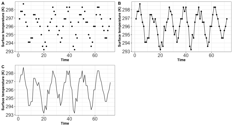
- Without the dots you emphasize on the general trend and not on the individual observation
- A plot with line + dots is called a line graph
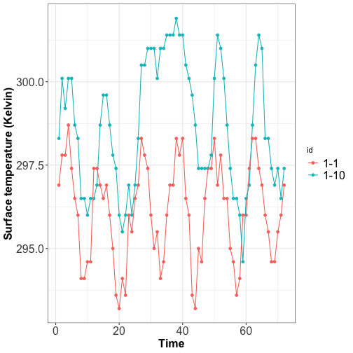
Visualizing time series
Display change between two time periods: dummbbell chart
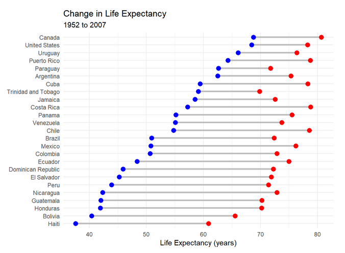
Source: Rob Kabacoff (2020)
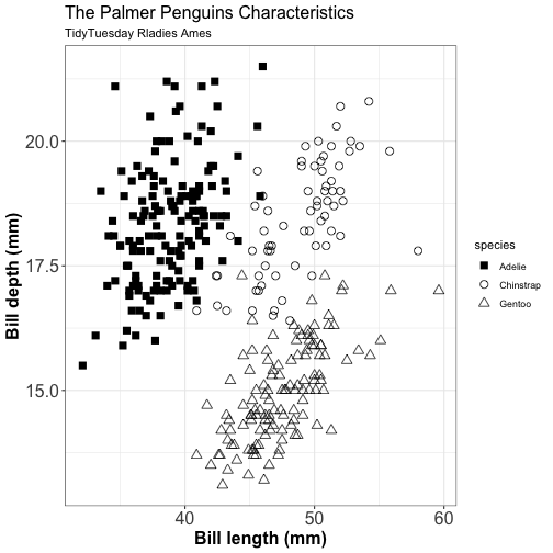
Color to distinguish
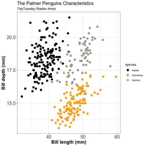
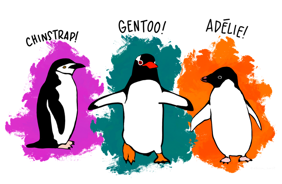
🐧
Color to highlight
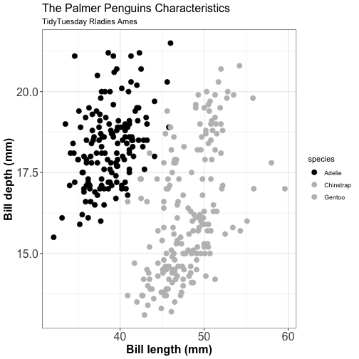
Something wrong?🤷
Color & shape to highlight
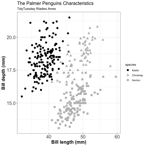
Alternative 1
Color & shape to highlight
Alternative 2
Opacity
Spatial distribution of drug related crimes in Chalottesville
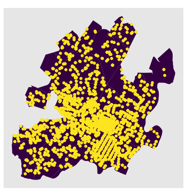
You can miss the interpretation of your graphic if the opacity is not set correctly
Opacity
Spatial distribution of drug related crimes in Chalottesville
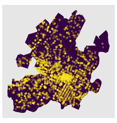
Control the opacity to avoid overlapping and provide shading
Tell a story with your data
Don't be repetitive but be consistent (theme, color scheme, font size etc.)
Tell a story with your data
Guide your audience by point out specific values
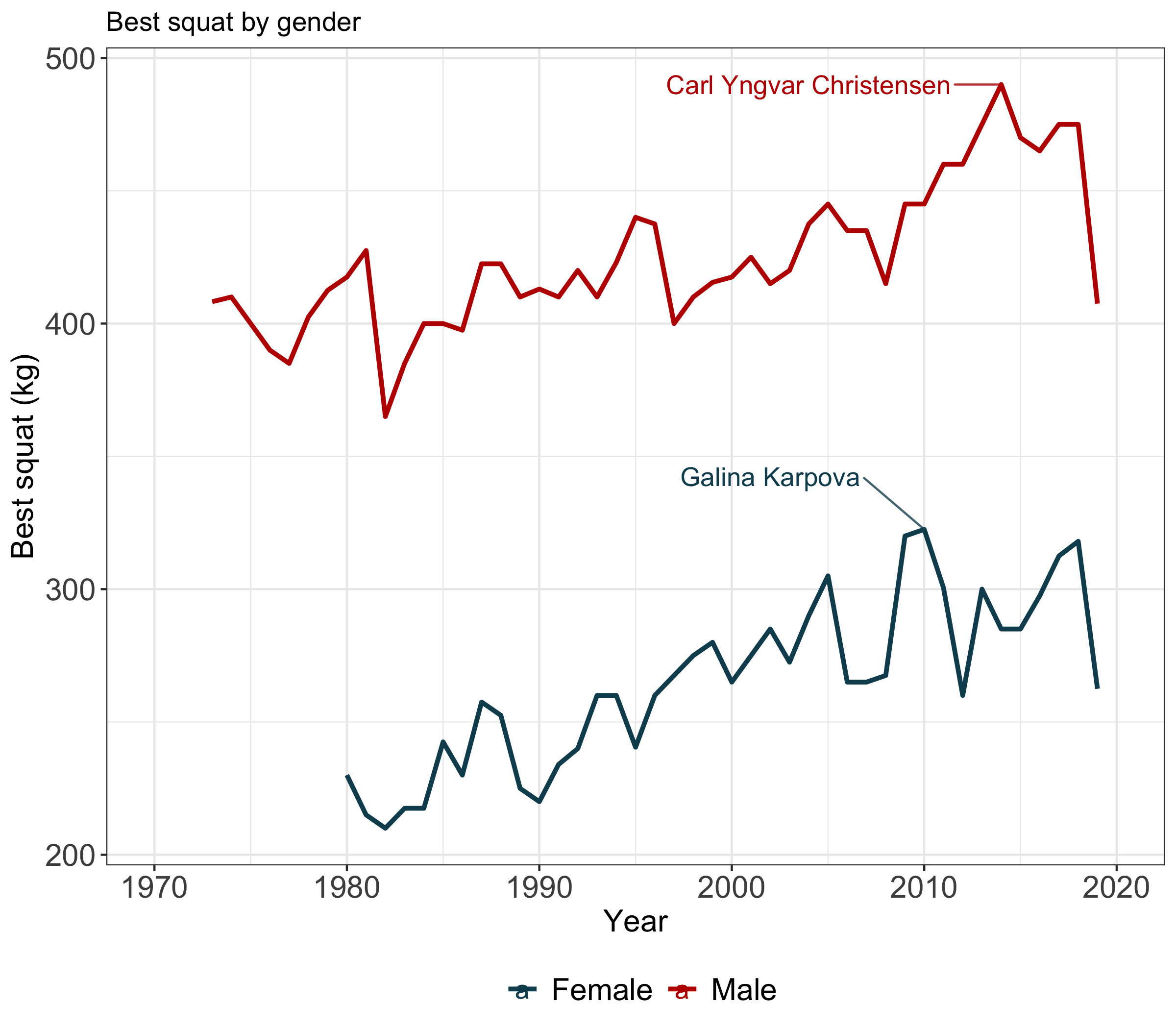
Tell a story with your data
Guide your audience by pointing out specific values
Tell a story with your data
Customize your plot using highlighting
Tell a story with your data
Customize your plot using highlighting + text
Interactive time-series with dygraphs
Lung deaths in UK
Thank you for your attention
✉️ my email: alaurent@iastate.edu
Slides created via the R package xaringan.